Dashboards
The
page offers charts and dashboard visualizations based on data stored within Ganymede.
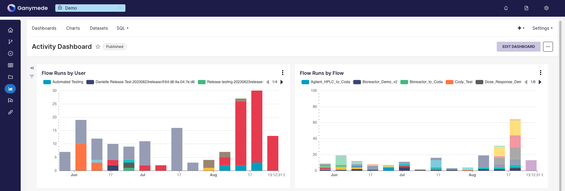
To assemble a dashboard:
- Add a dataset, either chosen from the environment or via SQL query
- Create a chart from the dataset
- Save the chart to add the chart to the specified dashboard.
- Modify dashboards and chart layouts by selecting the corresponding dashboard from the Dashboards tab in the top menu bar
Adding a Dataset
Datasets must be added from the environment prior to charting, either chosen from the environment (Physical Datasets) or created via an ANSI SQL query (Virtual Datasets) based prior to charting.
Adding Physical Datasets
Physical datasets are tables outputted from flows. To add a physical dataset:
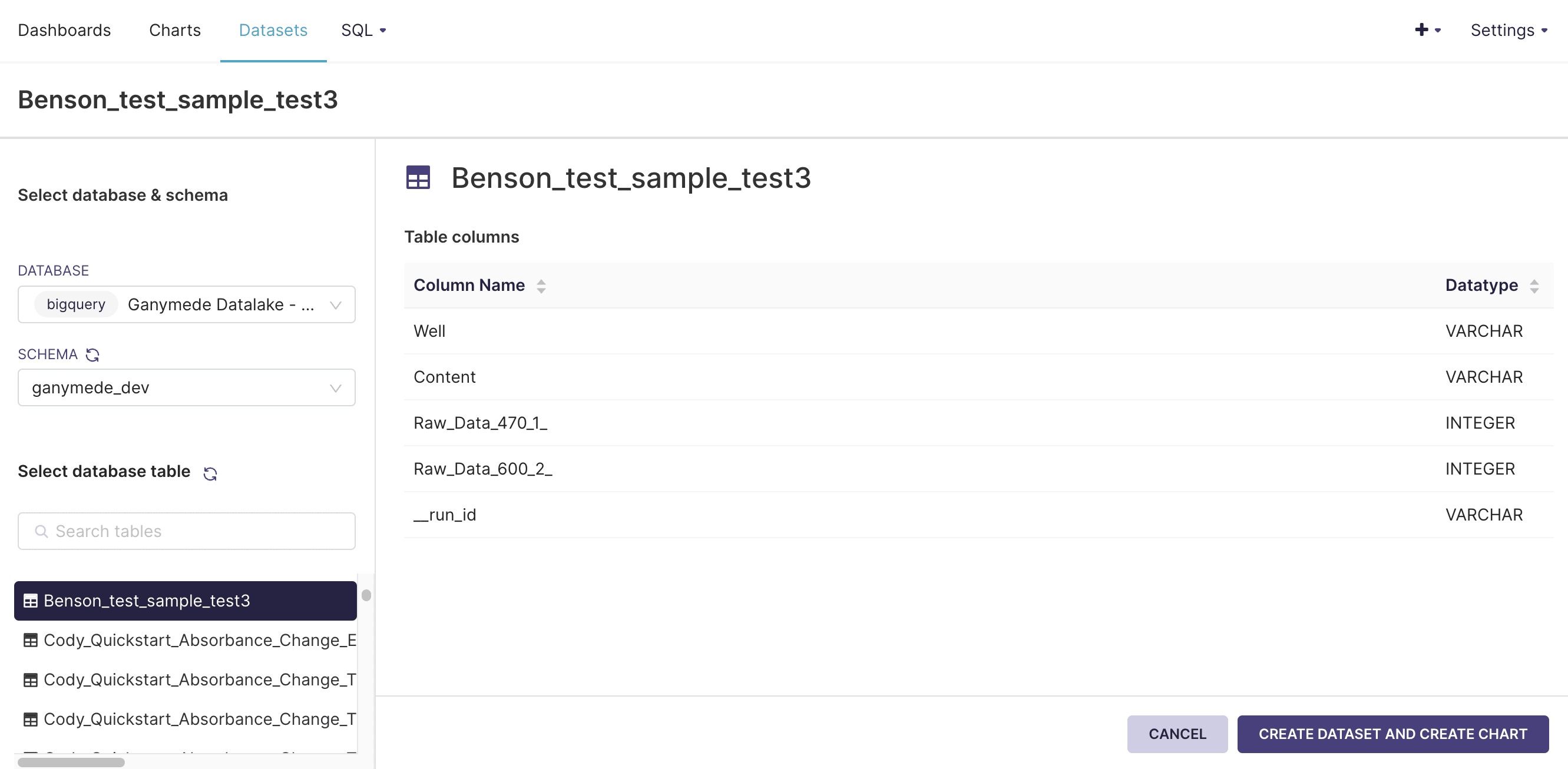
- Click on the Datasets button in the top bar:
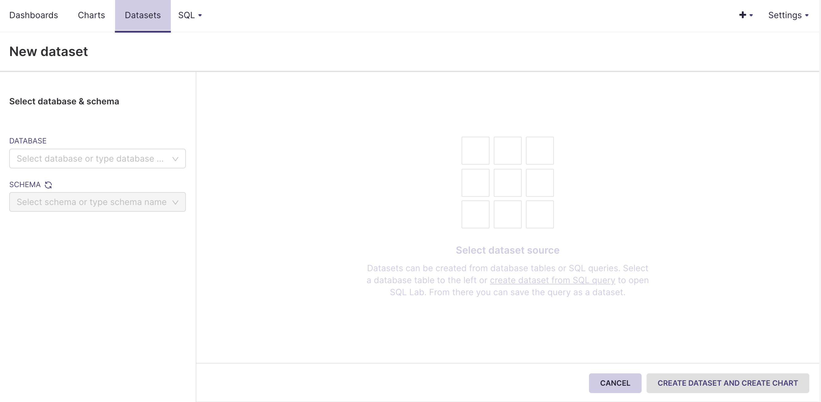
- Select a database, schema, and table to add and click .
Adding Virtual Datasets
Virtual datasets for the dashboard environment are constructed by querying existing tables.
- Hover over SQL in the top menu bar and click on SQL Lab. This should bring you to a SQL editor that lets you preview tables, and results of SQL queries:
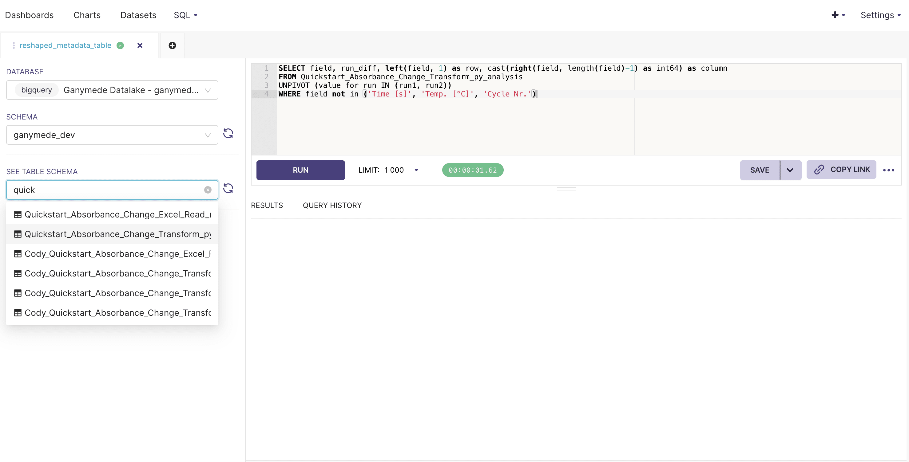
- Fill in the SQL Editor with a query string, select an appropriate number of rows to observe, and click to execute SQL.
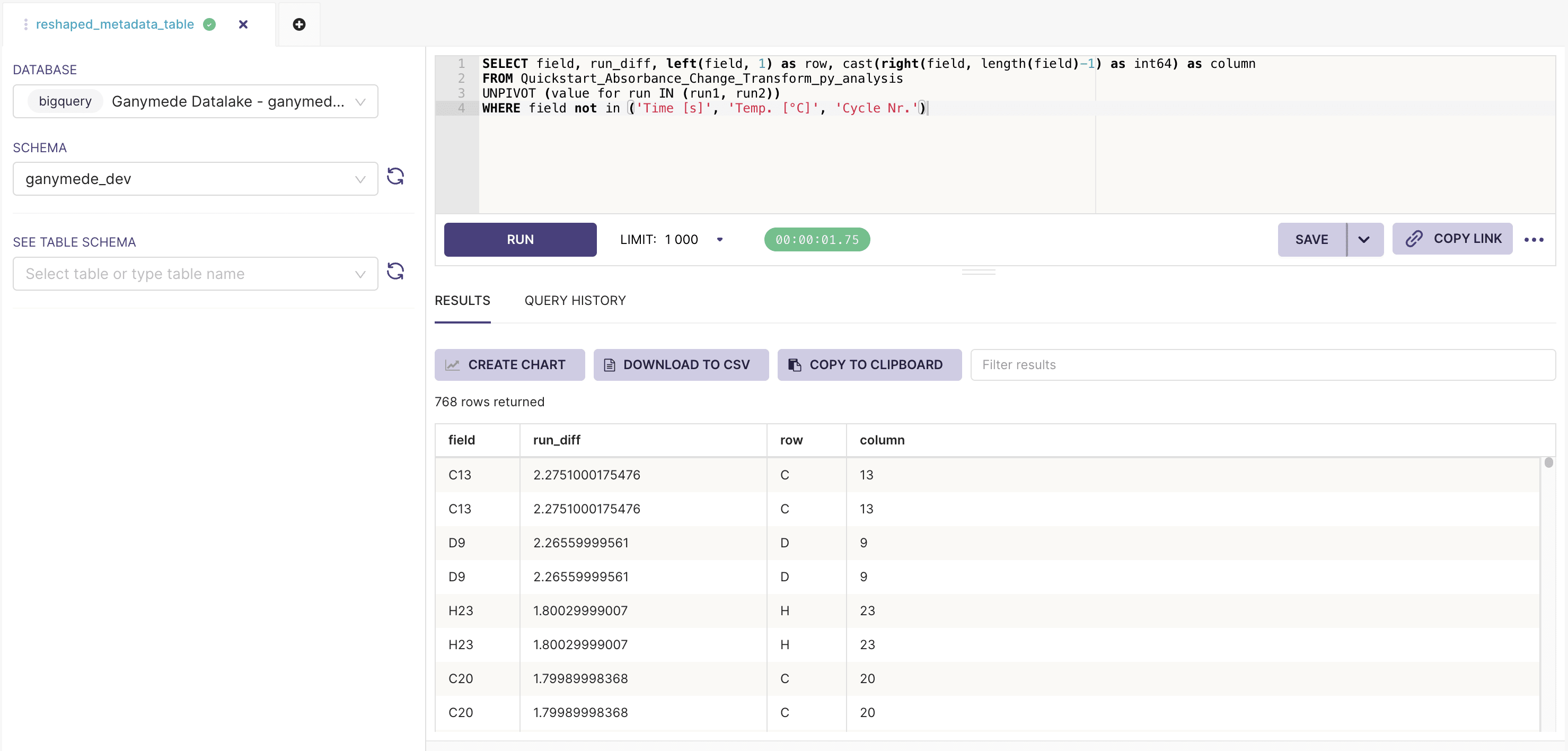
- Save a virtual dataset by clicking on the next to the button, and clicking on .
For a list of available functions and syntax guidance, please reference the SQL in BigQuery documentation.
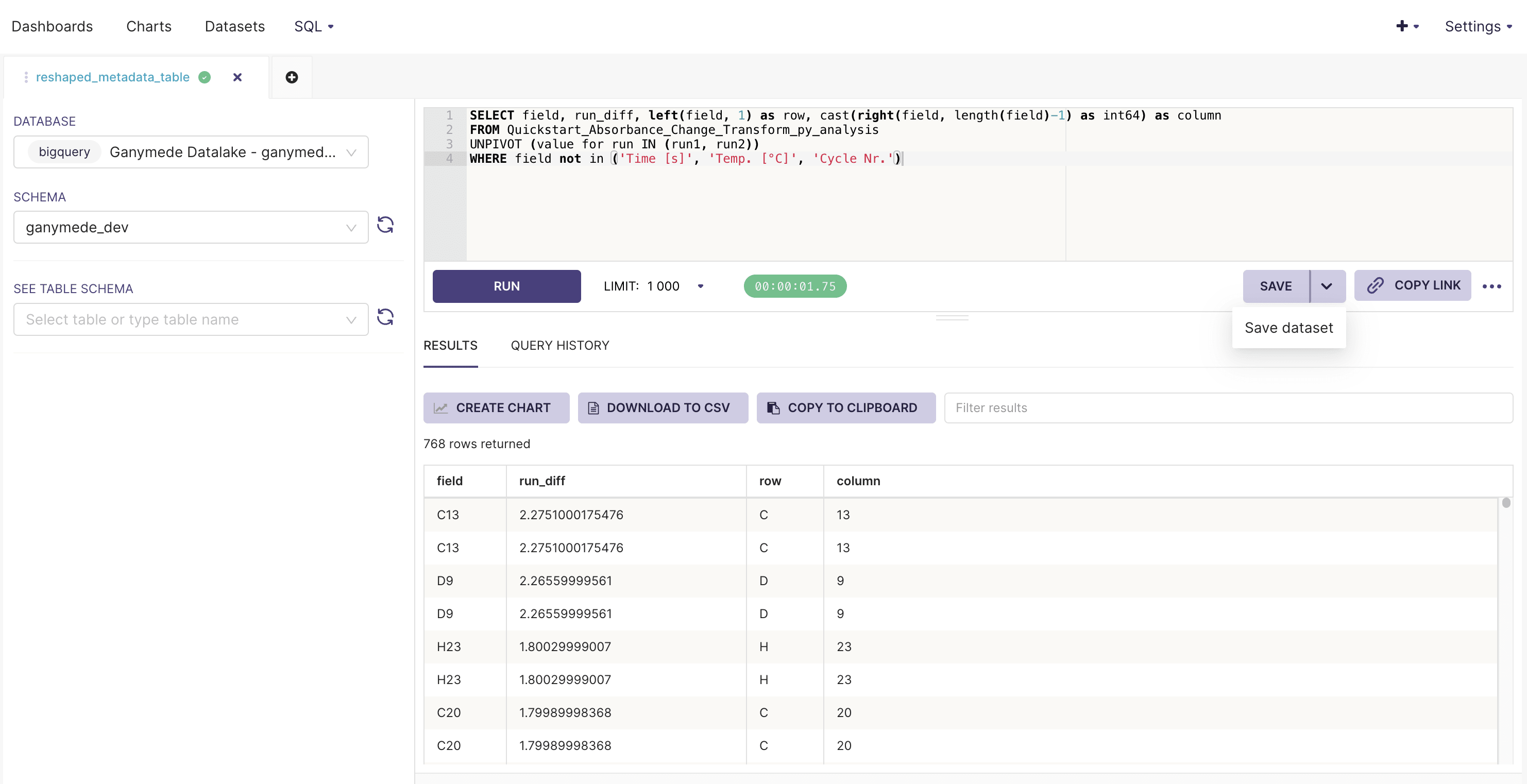
The
button saves SQL queries for future edits, but does not register a query as a virtual dataset.Creating a chart
Charts can be created from physical or virtual datasets.
To create a chart:
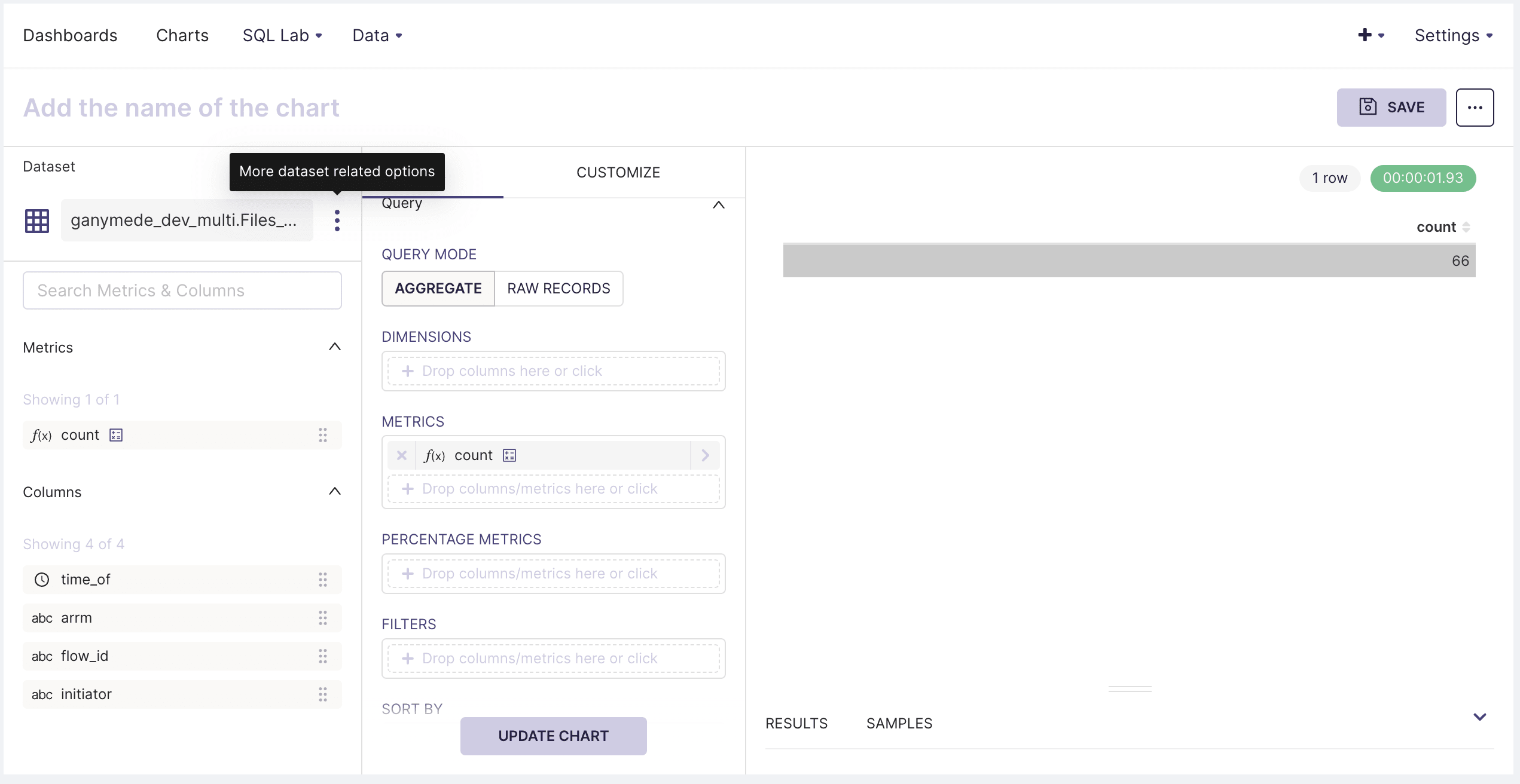
- Hover over Data in the top menu bar and click on Datasets. Then, click on one of the listed datasets, which should bring up the following pane:
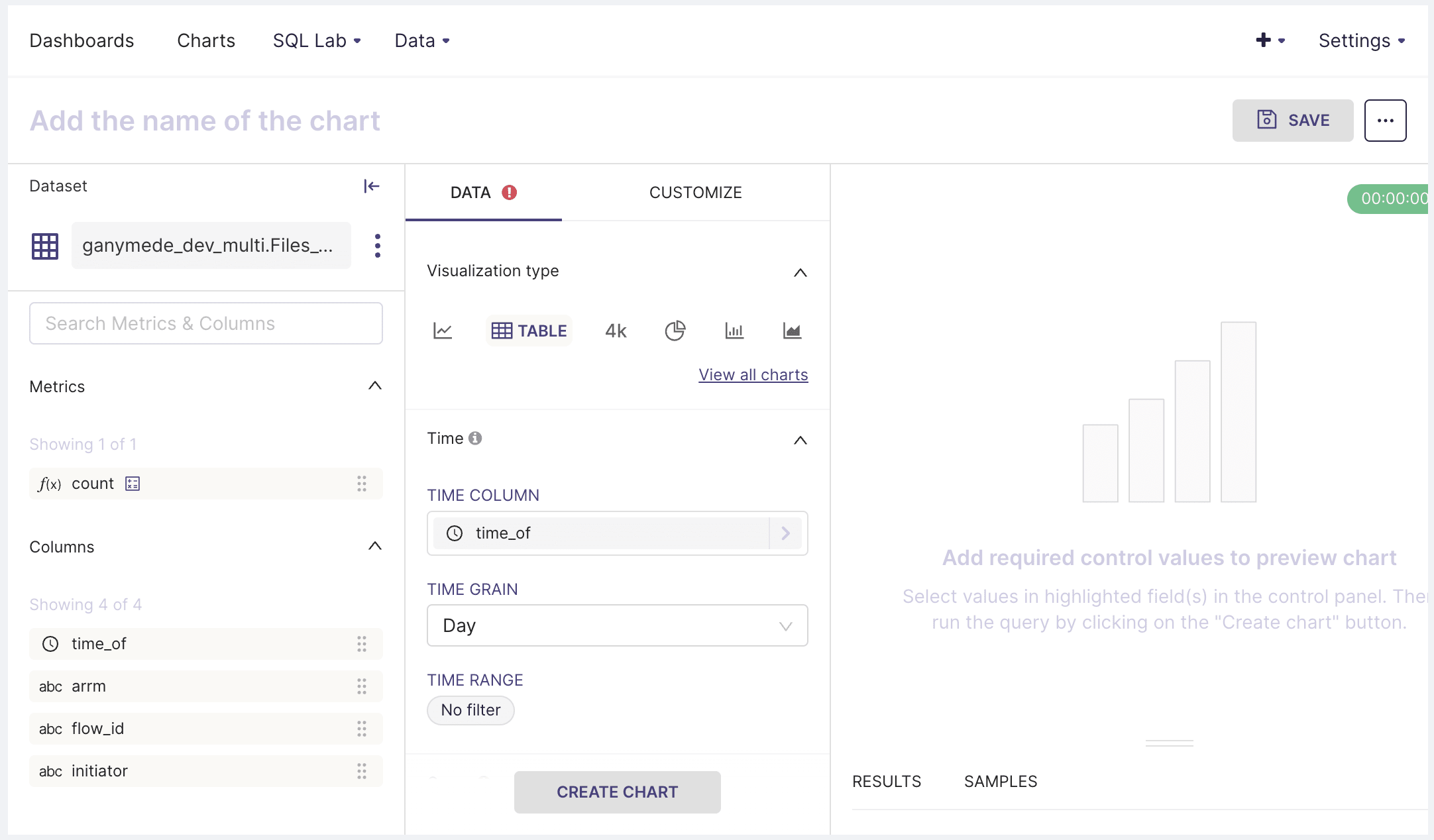
The DATA tab has controls for specifying chart type and pivoting/aggregating data from the selected table. The customize tab has functionality for annotating axis labels, specifying axis format, and chart title.
Saving charts to dashboards
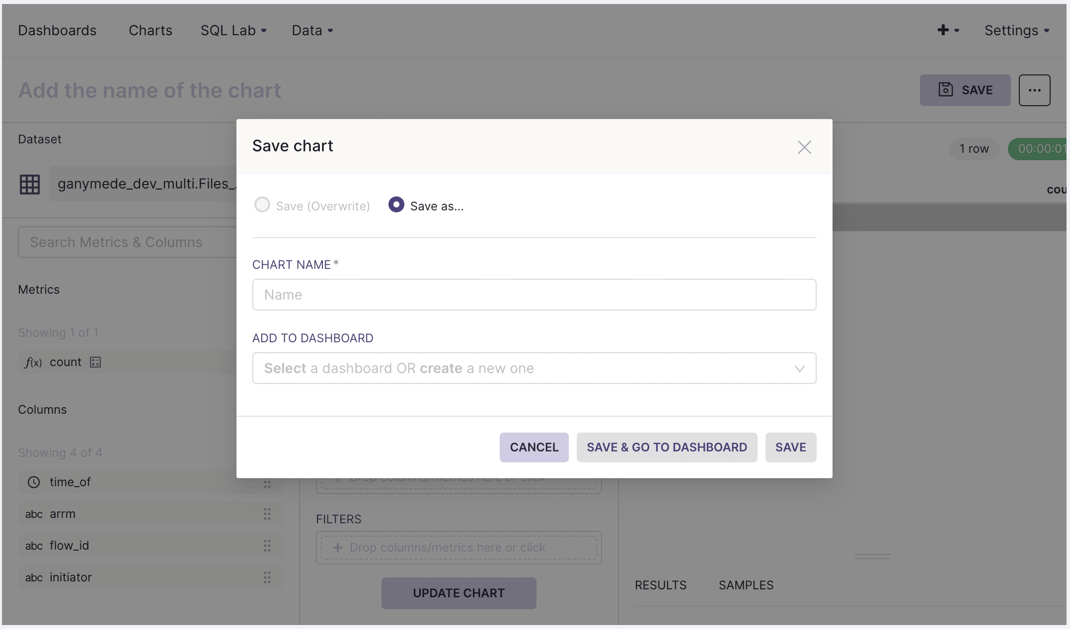
- Once the created chart looks satisfactory, add a chart to a dashboard by clicking on SAVE in the upper-right hand corner of the screen to bring up this modal:
Calculated columns
Calculated columns can be added to the dataset, which can be handy for correcting data for visualization. Some example use cases are:
- Taking the floor or ceiling of a variable to truncate data outside of a desired range
- Performing string manipulations on a field to categorize or subset data
- Extracting values from a string for aggregation
To create a calculated column:
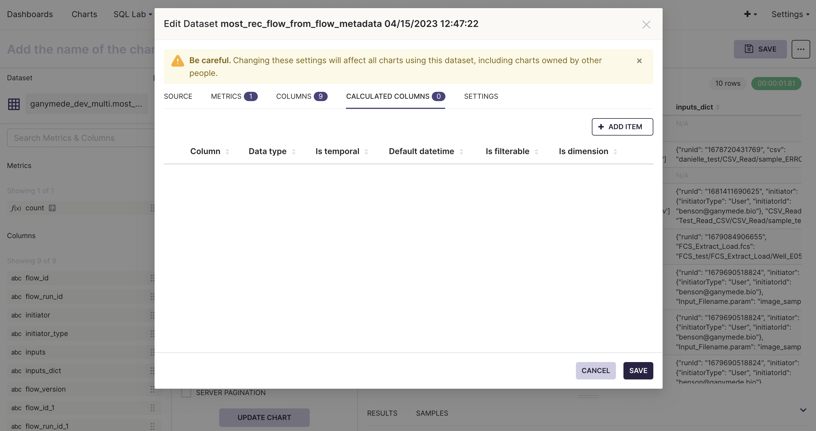
- Hover over the three dots to the right of the dataset on the Chart Creation page and click Edit Dataset.
- Select the Calculated Columns tab to add new columns to the dataset. Specify the field definition using a SQL expression.
Calculated columns are more flexible than what is found in other BI tools offering similar functionality. Beyond aggregation, these fields can be filtered on, sorted by, and/or used to categorize data.
Dashboards can only be edited by their owner. One method for multiple users to avoid conflicting dataset modifications would be for users of shared datasets to create virtual datasets for their own use.
Editing dashboards
To edit a dashboard, select Dashboards from the top menu bar and navigate to the desired dashboard. Clicking on
allows users to resize and rearrange the layout of different charts.Data backing the graphs can be filtered by clicking on the icon on the left side of the dashboard, selecting
and selecting the SCOPING panel.The SCOPING tab on the filters modal allows users to specify which graphs the filter applies to. Note that if 2 charts are backed by different datasets which share a field name, a single filter can be used to manipulate both tables simultaneously.
Tips and tricks
Dashboard chart shows an error message that the dataset is missing but it does exist and linked to the chart
If the chart was properly displayed in the the Edit Chart
page but it throws this error in the
dashboard then this could happen when you have two charts named the same where one has a missing dataset. The
dashboard could pull in the chart that has the missing dataset. You can fix this by renaming the
chart to be unique or delete the chart with the missing dataset.
How do you create bar plots with proportions and percentages?
In the chart editor page
- Click the
+ Drop columns/metrics here or click
in the metrics section of the query. - Move to the CUSTOM SQL tab
- Enter the following formula in the editor space
COUNTIF(my_column = 'my_value') / COUNT(*)
More general proportions can be found with
COUNT(*) / SUM(COUNT(*)) OVER (PARTITION BY x_axis_variable)
I added a new column but I do not see it in the columns side bar in the editor chart page.
In the chart editor page
- Click the ⋮ in the
Chart Source
side bar - Click editor
Edit dataset
- Click the COLUMNS tab
- Click
SYNC COLUMNS FROM SOURCE
- Save
I do not see the full range of values on the x-axis of my line plot
This could be due to there being to many digits in the data being displayed, which can be fixed by rounding the data.
- Click the column of interest in
X-AXIS
Query section - Click the CUSTOM SQL tab
- Modify the sql command to be
ROUND(my_column, 2)
- Update chart
I am creating a line chart but the line is patchy and not full connected
If the spacing between adjacent data points is too large, superset will have trouble connecting the points together. You can fill in the data in the chart editor page
- Expand the
Advanced analytics
section in the DATA tab - Select an option in the
RULE
such as 1 hourly frequency - Select the
FILL METHOD
such as Linear interpolation - Update chart
Another approach might be to increase the ROW LIMIT
in the DATA tab if you have a large
dataset.
I am creating a line chart but there are regions of the plot with missing data
Sometimes the superset will have trouble displaying any data in certain regions of the line chart. You
can confirm that the plot recognizes that point by hovering the mouse in those regions to see if
a hover box displays with the values. If the data is not time-series, you can try turning on marker
in the Chart Options
of the Customize tab. This will at least allow you to see the data points
in the plot.
Including headers, text, dividers, and tabs to dashboard
- In the dashboard page, click
EDIT DASHBOARD
- On the right side of the page, click the LAYOUT ELEMENTS tab
- Drag and drop tabs, text boxes, headers, etc
These can be used to add descriptions to your dashboard. The text boxes and headers are markdown editors which can include hyperlinks that can point to flow pages or other dashboards. The tabs allow you to separate out charts into different tabs to group relevant charts together. Filters can be configured to work with different tabs. Filters that are not relevant to the specific tab you are on will be hidden under a dropdown and classified as out of scope. Tabs act as their own mini dashboards with unique links that will point to that tab in the dashboard.
I am creating a line chart with time series but getting a 404 Post Error... Braced constructors are not supported
This could mean that superset is having trouble recognizing your time series variable as a time stamp
or datetime variable. You can try creating a calculated variable in the Edit dataset
from Chart Source
and do
CAST(my_time_variable AS TIMESTAMP)
Then set the variable type to DATETIME in the DATA TYPE section.
Creating more meaningful labels for table chart types
Variables are saved with to the database with spaces and special characters replaced with
underscores. However, you can change the label shown in tables with something more meaningful such
as adding spaces, units, etc in the Edit dataset
from Chart Source
. In the Columns
tab, click
the dropdown for the variable you want to add a label to and fill in the LABEL field. For an
example, if your variable is my_variable
you can set the label to be My Variable (units)
and
this would automically set the column name in your table chart types to this new label.