Create a Dashboard
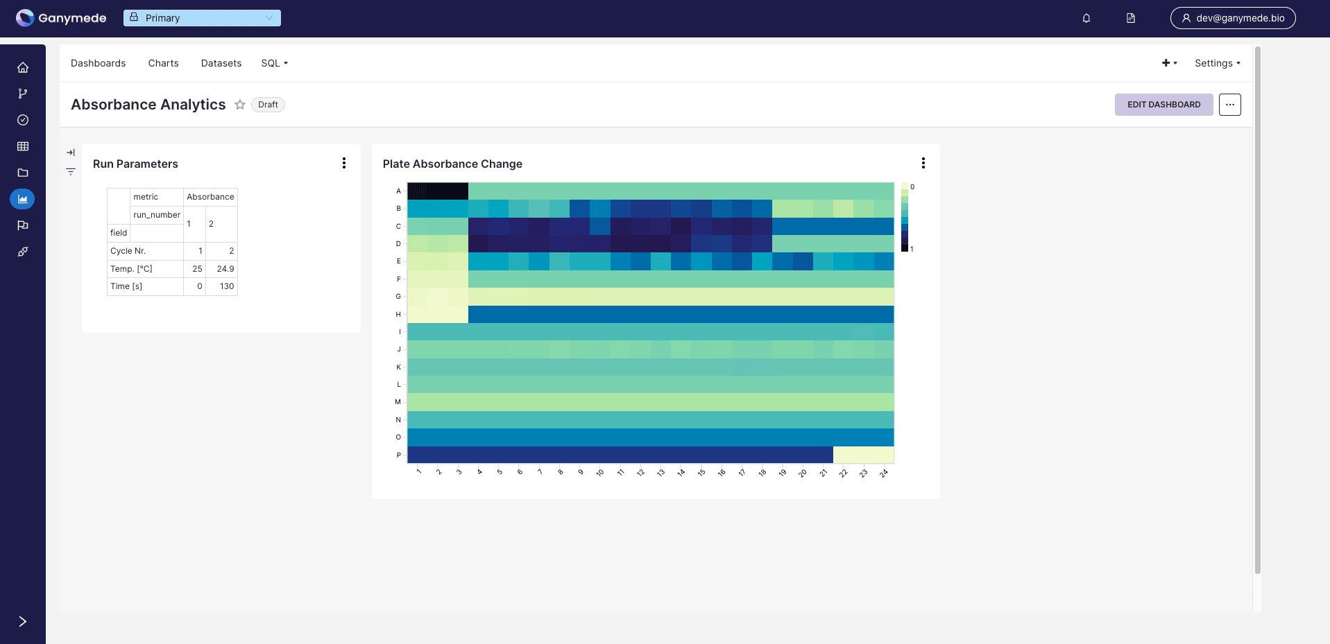
This guide walks you through creating a dashboard to compare the output data from a plate reader at two different timepoints, which has been ingested into Ganymede. This dashboard leverages the same data processed in the Build a Flow guide. By the time you're finished, you'll have converted raw data to a dashboard that looks like this:
To do this we'll proceed through the following steps:
- Sign into Ganymede
- Set up virtual datasets
- Build charts from those virtual datasets
- Add those charts to a dashboard
Step 1: Sign into Ganymede
The
button should be available once authentication is configured for your tenant, which is generally going to be a web address accessible via any web browser with the URL https://<your_tenant>.ganymede.bio.You may need to enable pop-ups for Ganymede or disable any ad-blocking software for the ganymede.bio domain.
Step 2. Create virtual dataset for this visualization
In order to create our dashboard we'll need to create two datasets for displaying:
- Quickstart_Absorbance_Change_Absolute_Differences dataset - a table containing absorbance measurements from two different plates
- Quickstart_Absorbance_Change_Run_Parameters dataset - a table containing temperature and timepoint metadata associated with each plate
Step 2a. Load plate reader data for charting
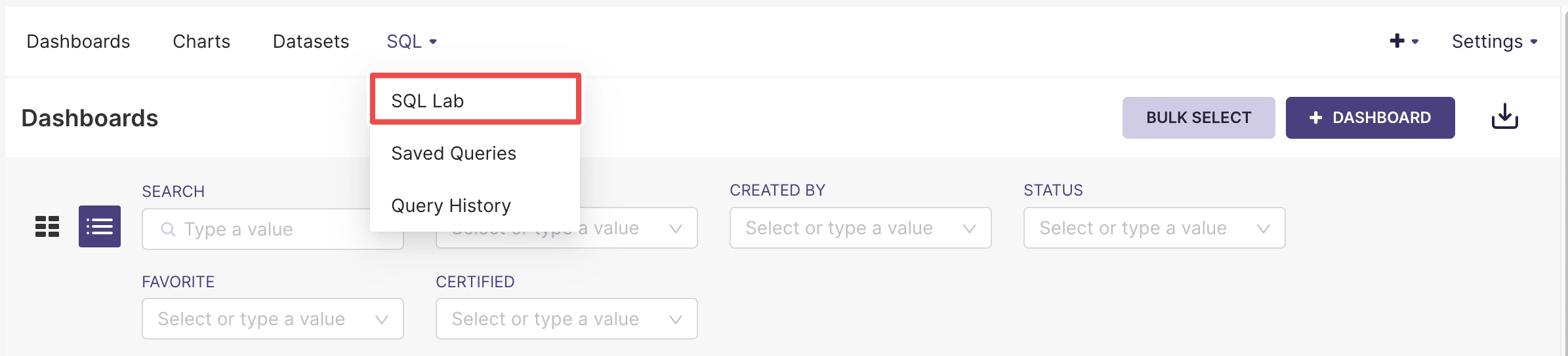
Hover over SQL in the top menu bar and click on SQL Lab. This should bring you to a SQL editor that lets you preview tables, and results of SQL queries:
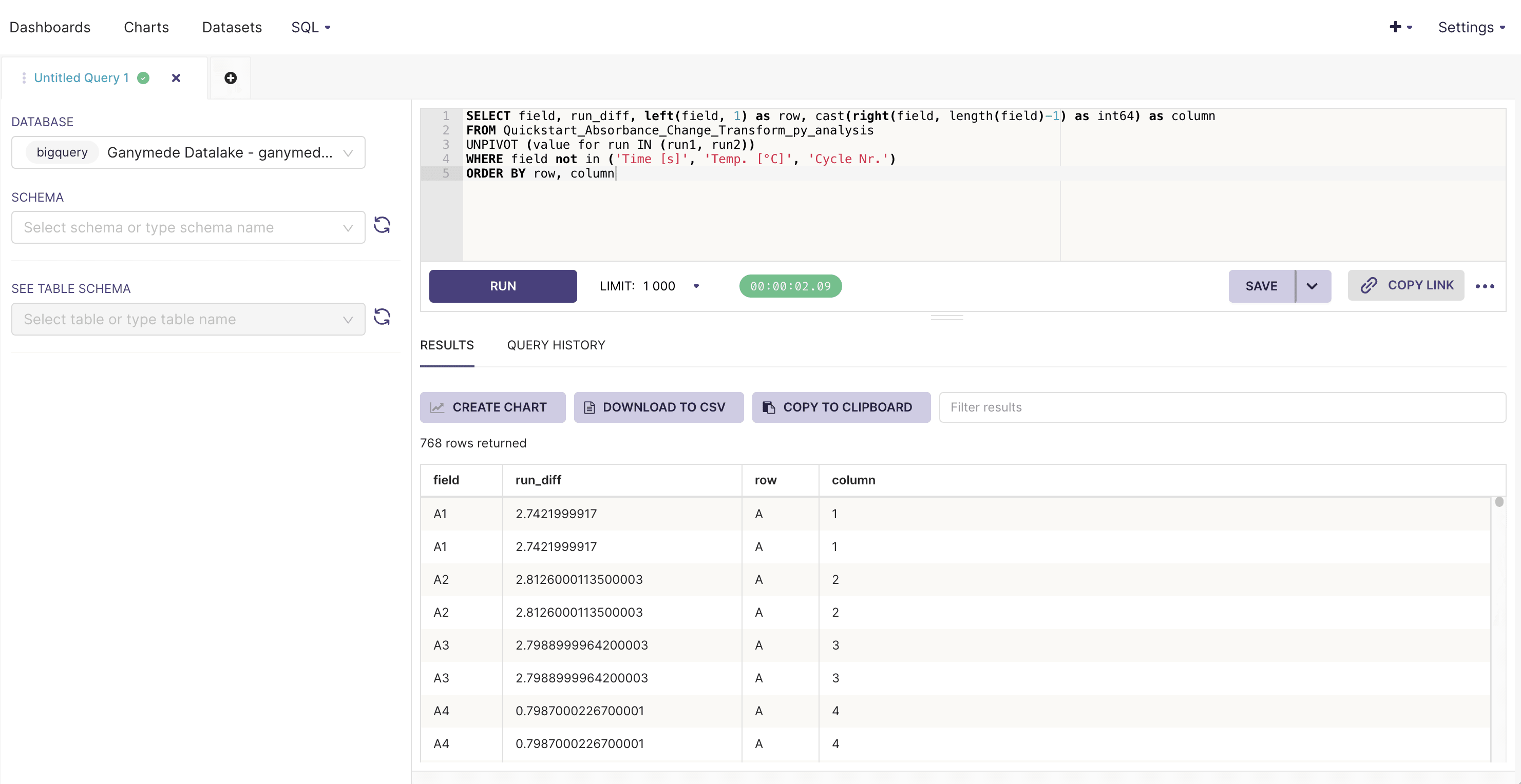
Fill in the SQL Editor with the query below and click
to execute SQL.-- Quickstart_Absorbance_Change_Run_Parameters table
SELECT field, run_diff, left(field, 1) as row, cast(right(field, length(field)-1) as int64) as column
FROM Quickstart_Absorbance_Change_data
UNPIVOT (value for run IN (run1, run2))
WHERE field not in ('Time [s]', 'Temp. [°C]', 'Cycle Nr.')
ORDER BY row, column
After doing so, the SQL editor should return the results of the query:
Save a virtual dataset to make it available for graphing by clicking on the
to the right of the button. Save the dataset as Quickstart_Absorbance_Change_Absolute_Differences.Step 2b. Load plate reader metadata for charting
Navigate back to the SQL Editor and repeat step 2a with the query below, saving the output virtual dataset as Quickstart_Absorbance_Change_Run_Parameters.
-- Quickstart_Absorbance_Change_Absolute_Differences table
SELECT field, value, trim(run, 'run') as run_number
FROM Quickstart_Absorbance_Change_Excel_Read_results
UNPIVOT (value for run IN (run1, run2))
WHERE field in ('Time [s]', 'Temp. [°C]', 'Cycle Nr.')
Step 3. Create run parameters pivot table
Navigate to the Datasets tab in the top bar and search for "Quickstart" to find the virtual datasets you created.
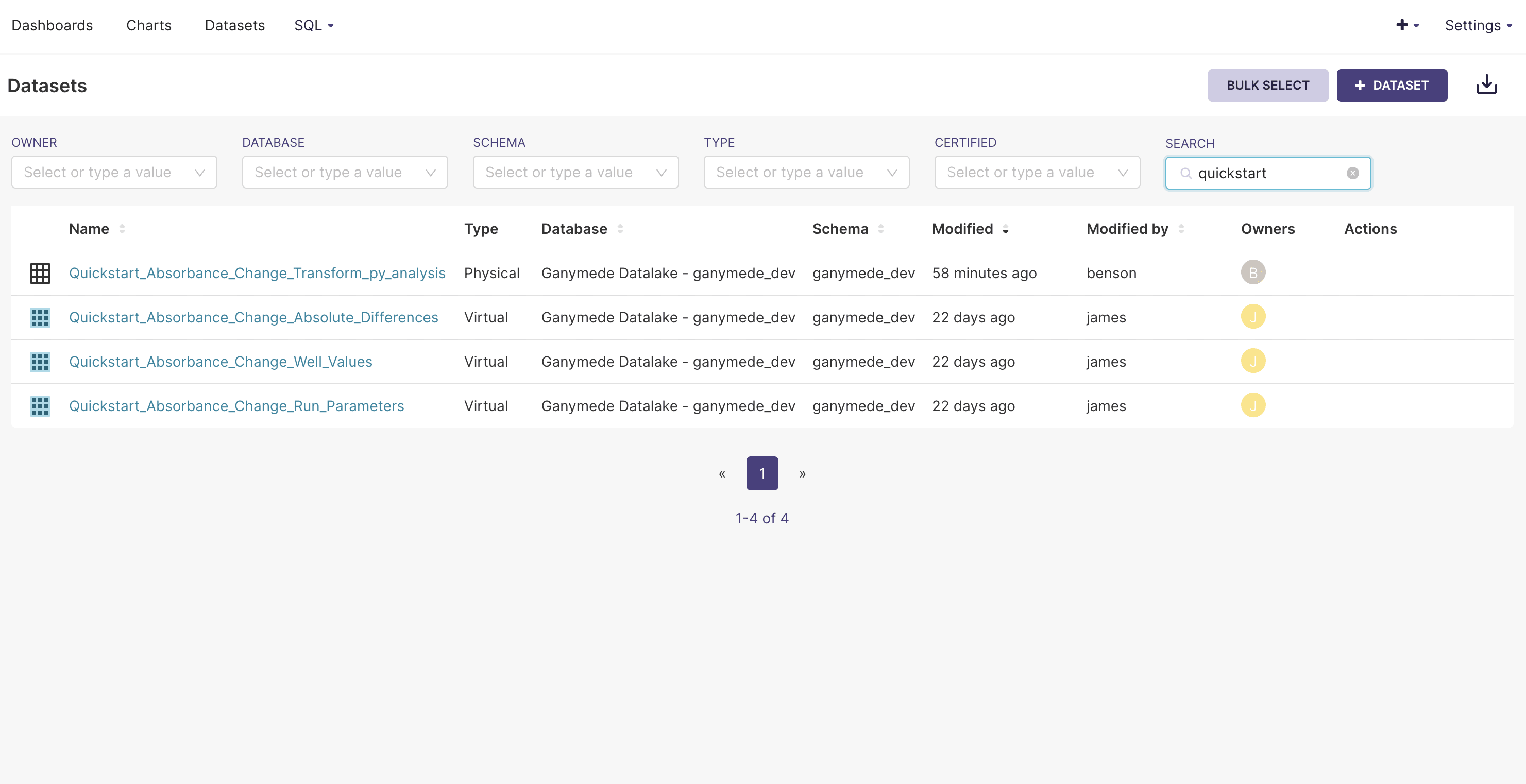
Click on the Quickstart_Absorbance_Change_Run_Parameters table. This should bring you to a page for assembling a chart:
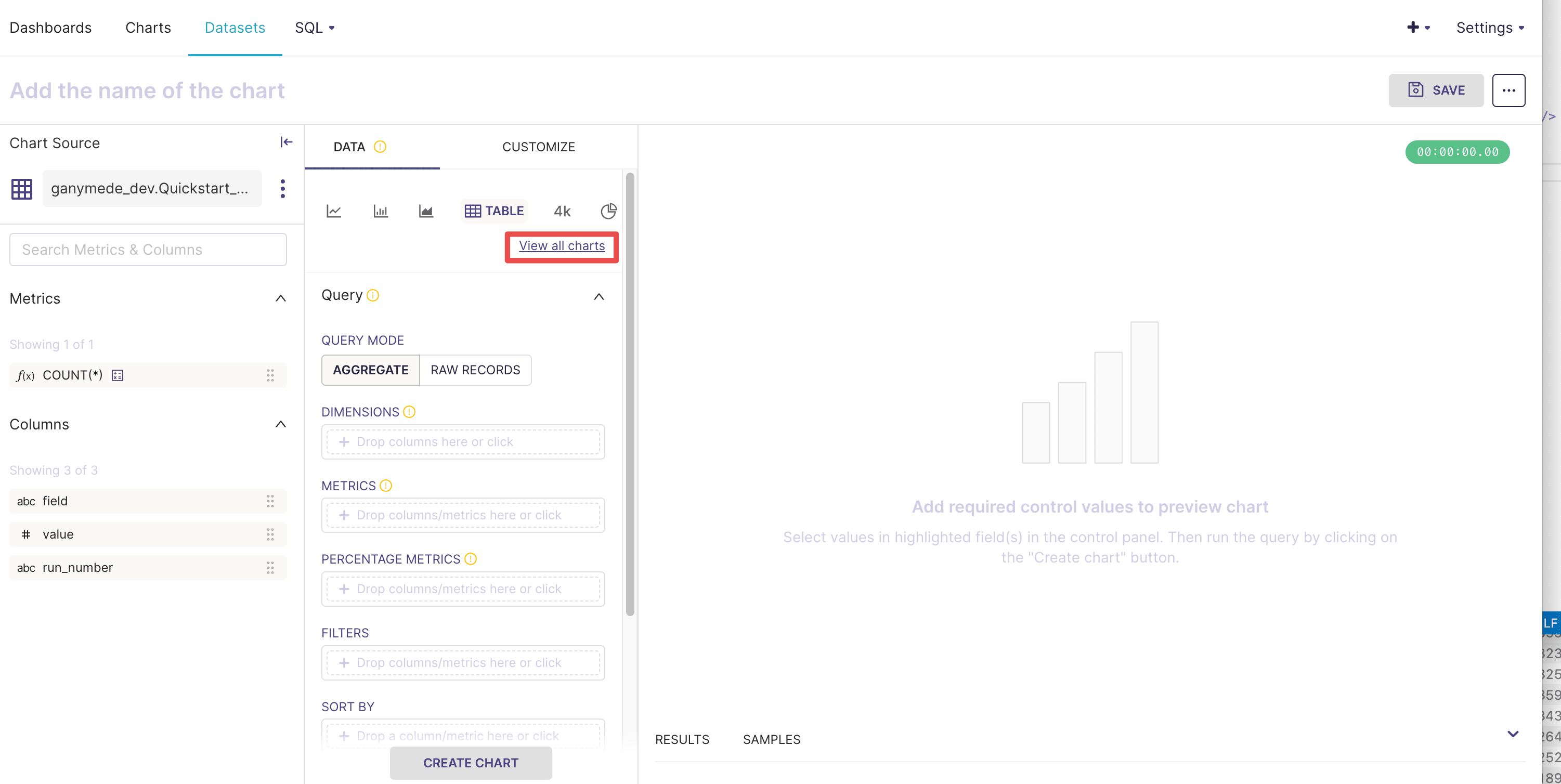
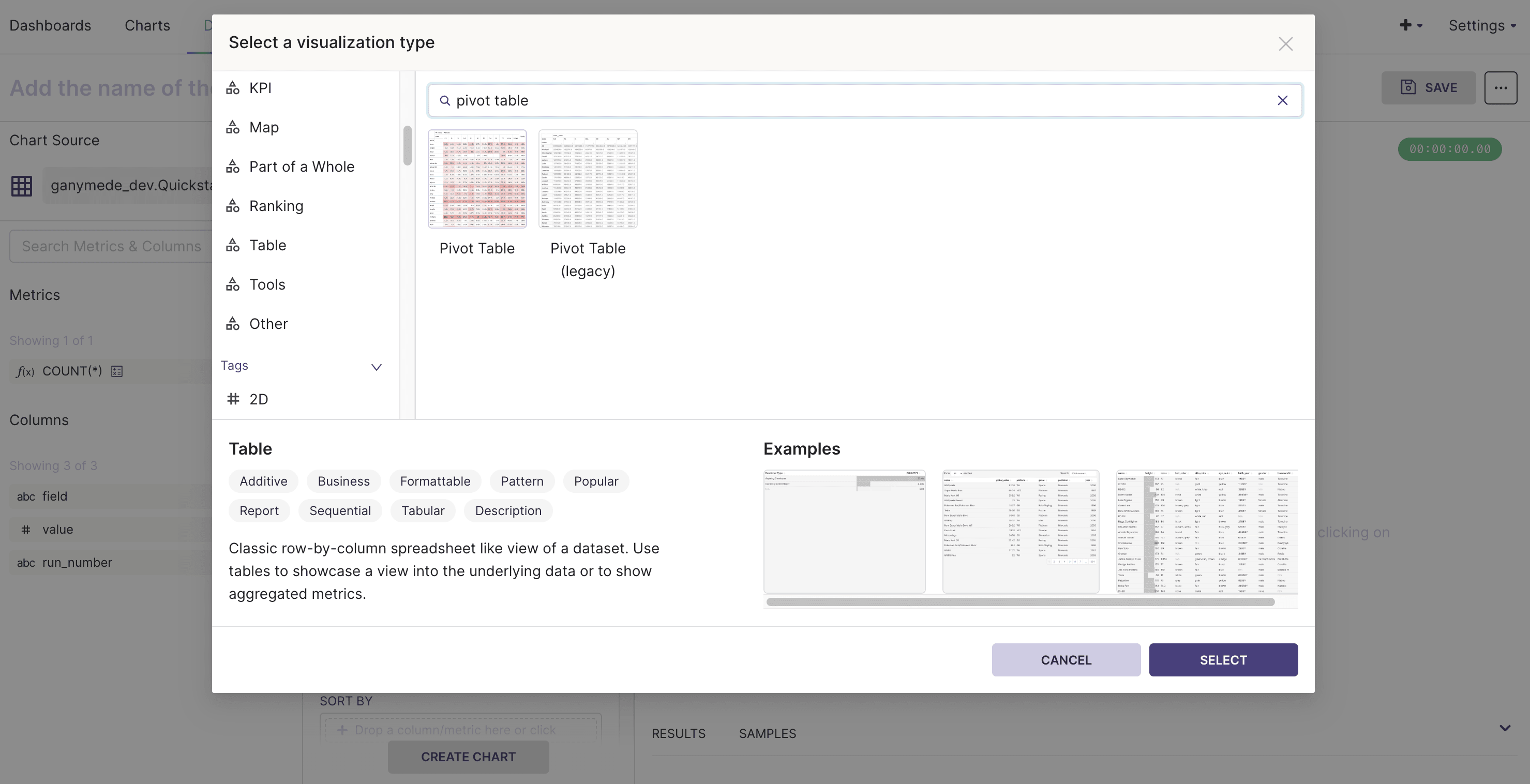
Click on the View All Charts within the Data tab of the middle section (highlighted in red above), and select the Pivot Table chart type.
Assemble the pivot table by dragging the fields in the virtual table into the Query section. Name the chart "Run Parameters" as shown below.
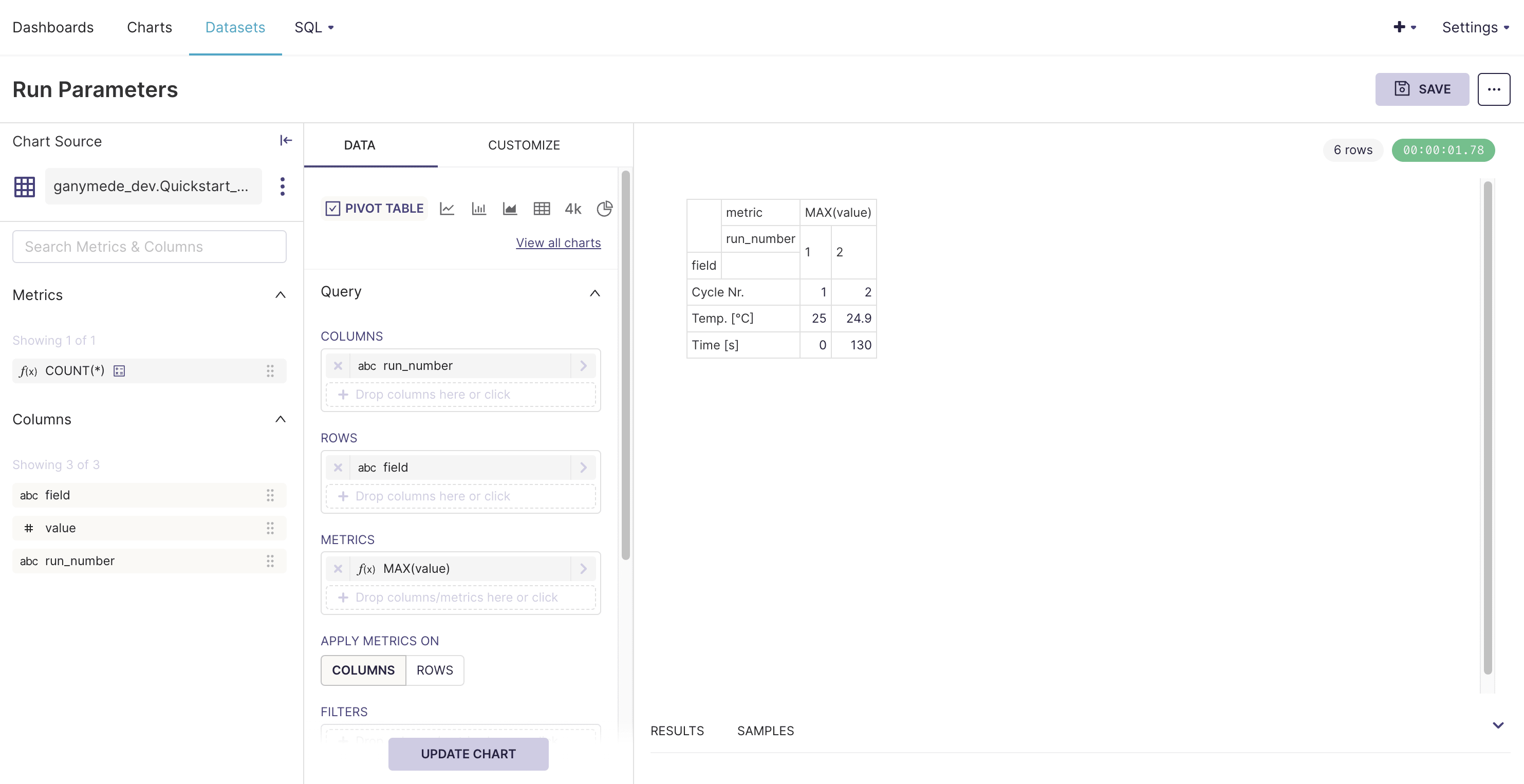
Click
to save the chart and add to a new dashboard named "Absorbance Analytics."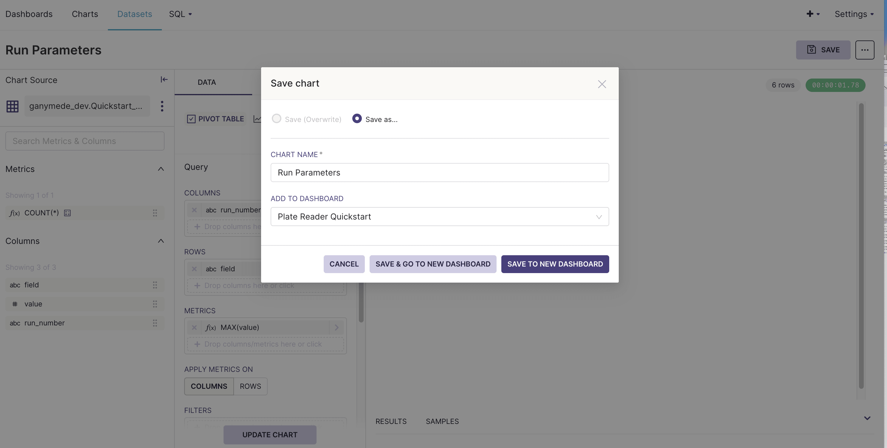
Step 4. Create plate reader heat map
Navigate to the Datasets tab in the top bar and select the "Quickstart_Absorbance_Change_Absolute_Differences" virtual dataset created earlier.
Click on View All Charts and select "Heatmap" as the visualization type.
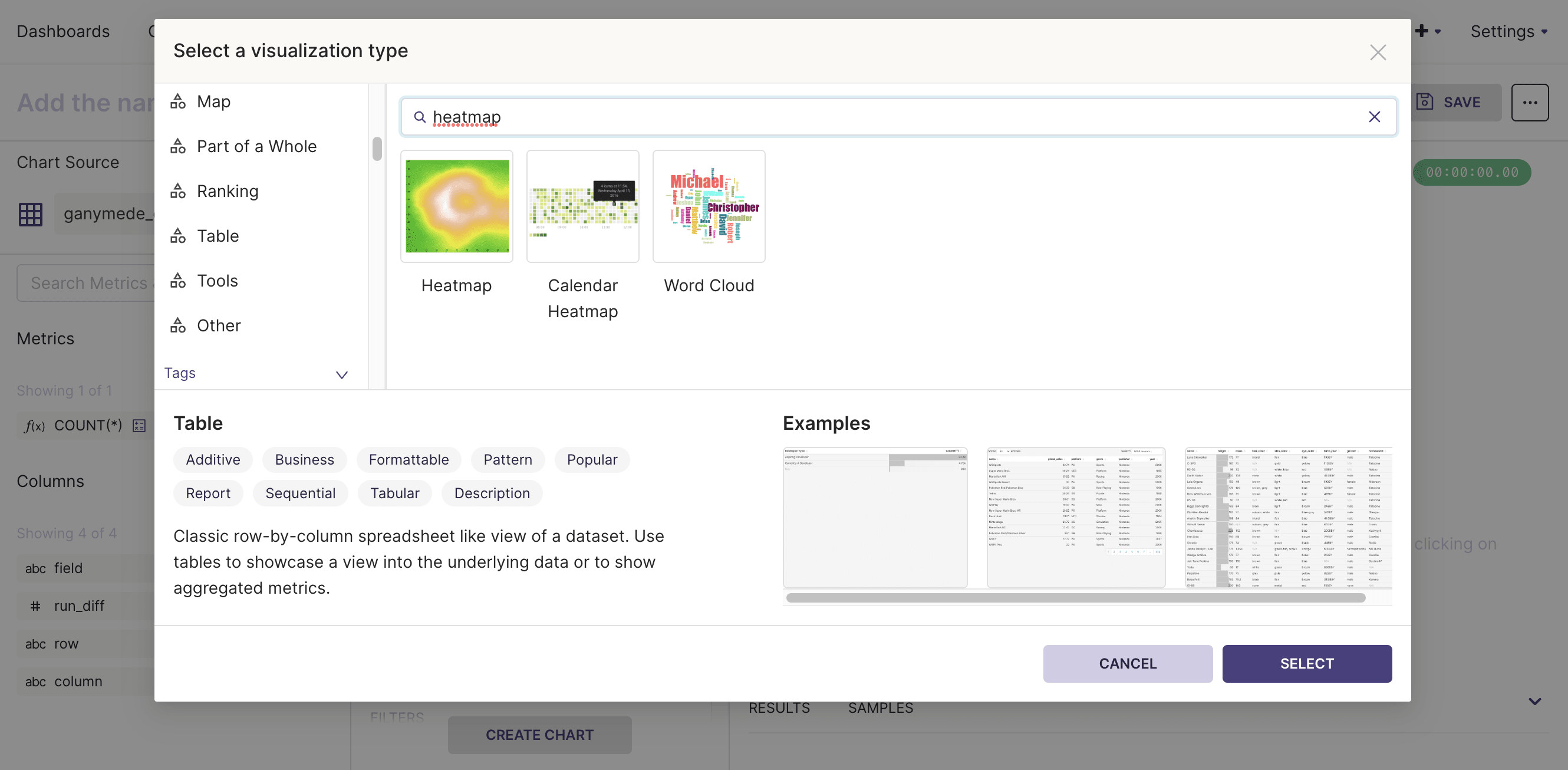
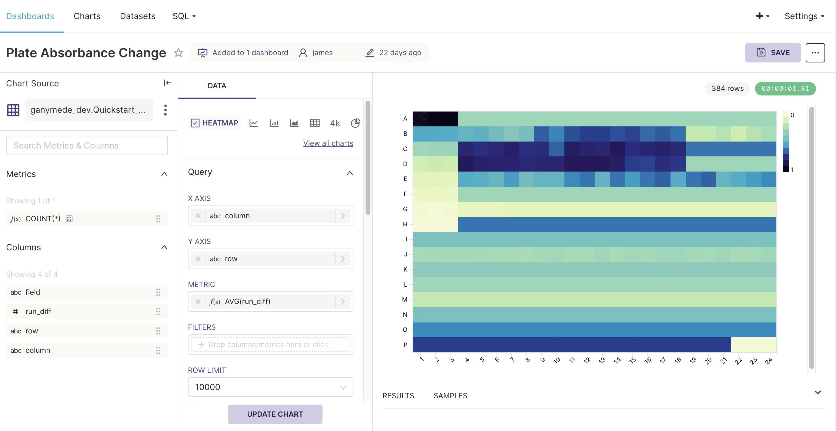
Assemble the heat map as shown below, and name the chart "Plate Absorbance Change."
Click
to save the chart and add the chart to the "Absorbance Analytics" dashboard created in Step 3.
Step 5. Orienting the dashboard
Click on the Dashboards button in the top bar and select the Absorbance Analytics dashboard.
Arrange the dashboard by clicking on the
button in the top right hand corner of the screen. In the edit mode, tables and graphs can be resized and moved to different rows.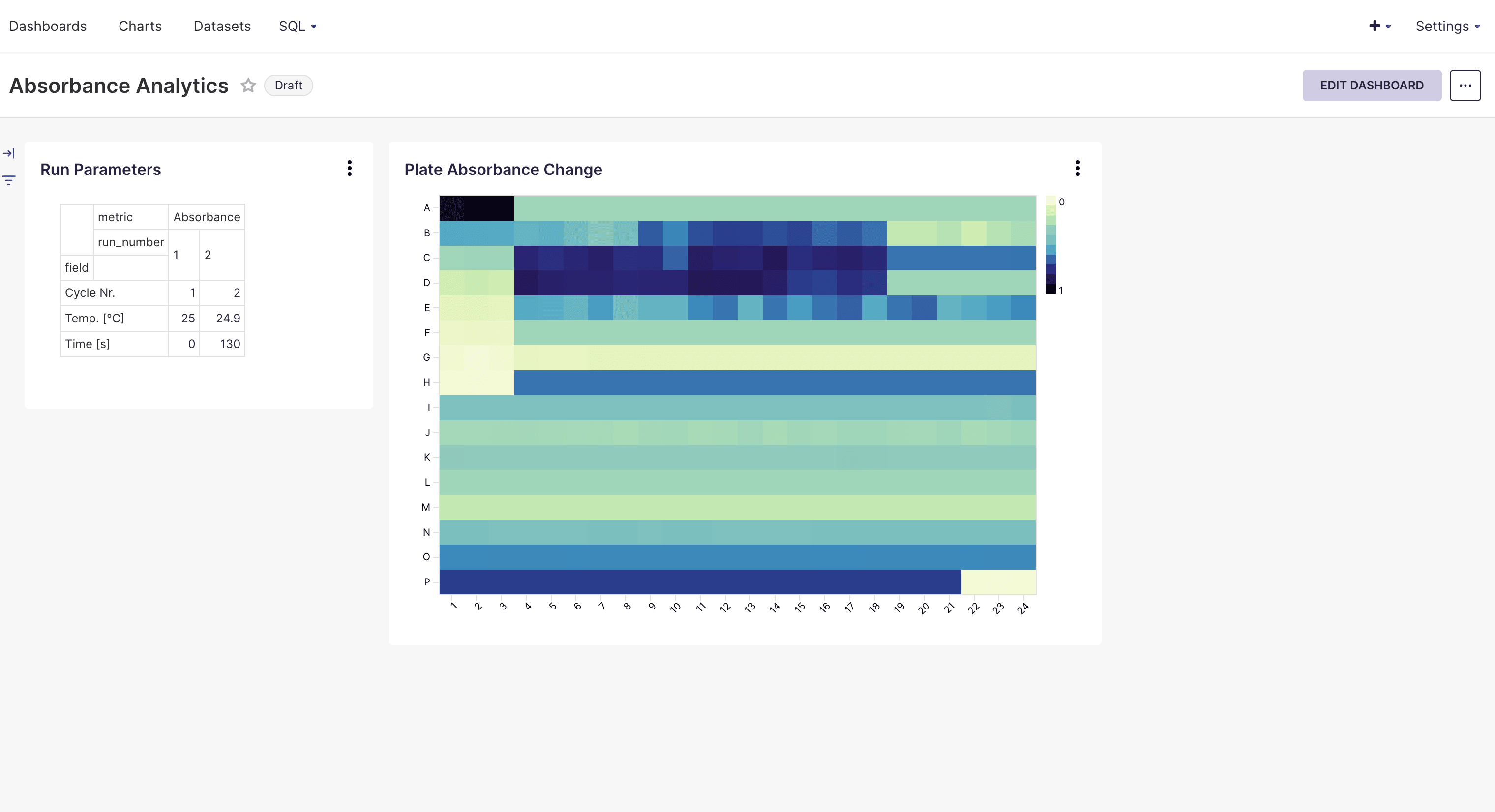
When you're satisfied with the arrangement, click SAVE. You've just built your first dashboard in Ganymede!
If you run into any challenges with the Quickstart, check out the tips and tricks section of the Dashboards page or contact Ganymede Support.