Dashboards
The
page offers charts and dashboard visualizations based on data stored within Ganymede.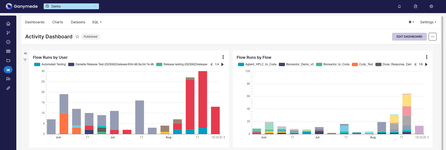
To assemble a dashboard:
- Add a dataset from the environment or create one via SQL query.
- Create a chart from the dataset.
- Save the chart to a specified dashboard.
- Modify dashboards and chart layouts by selecting the corresponding dashboard from the Dashboards tab in the top menu bar.
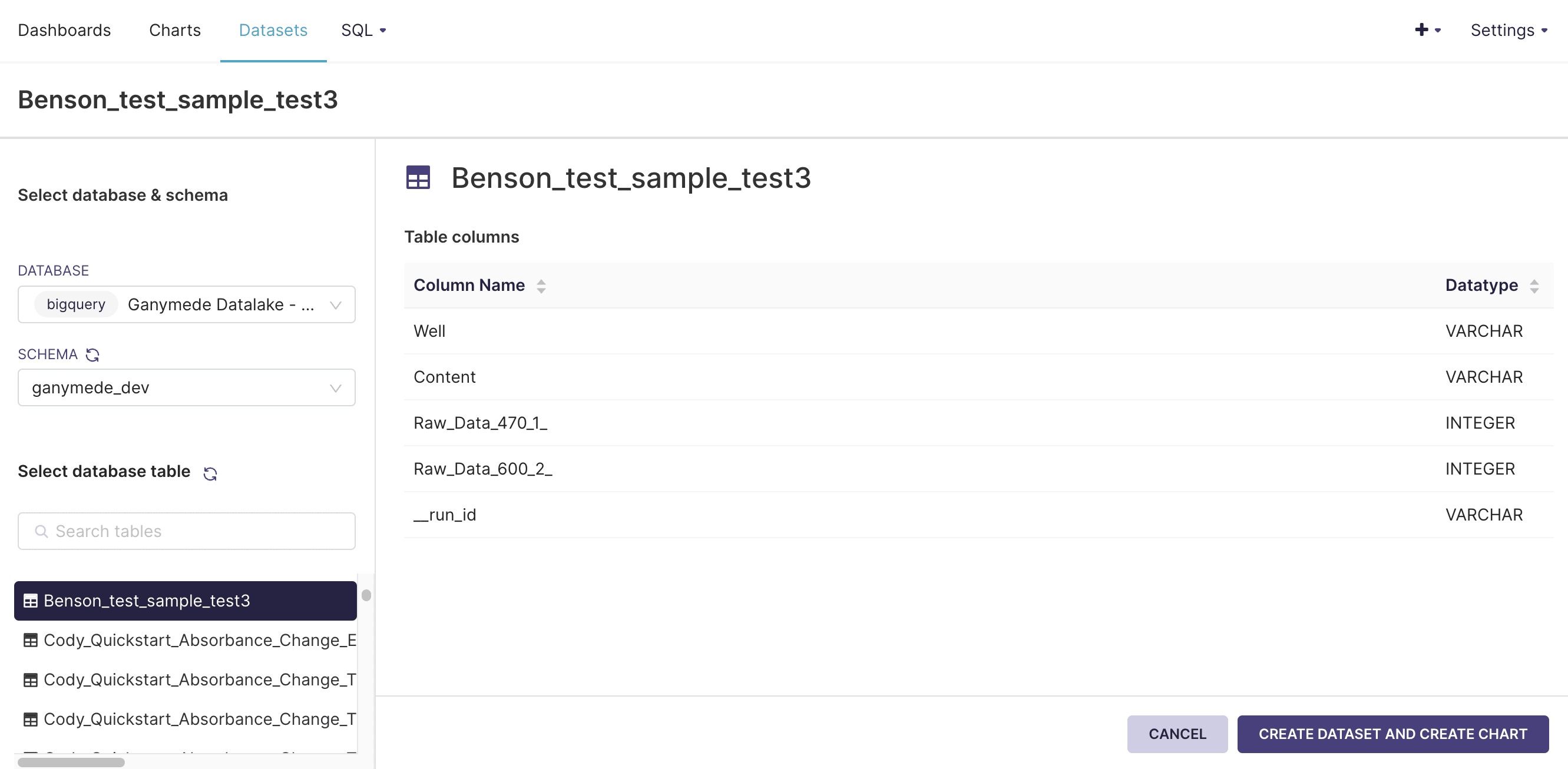
Adding a Dataset
Before creating charts, you will need to add datasets from the environment. These can be either (Physical Datasets) or Virtual Datasets (created via an ANSI SQL query).
Adding Physical Datasets
Physical datasets are outputted by Flows. To add a physical dataset:
- Click on the Datasets button in the top bar:
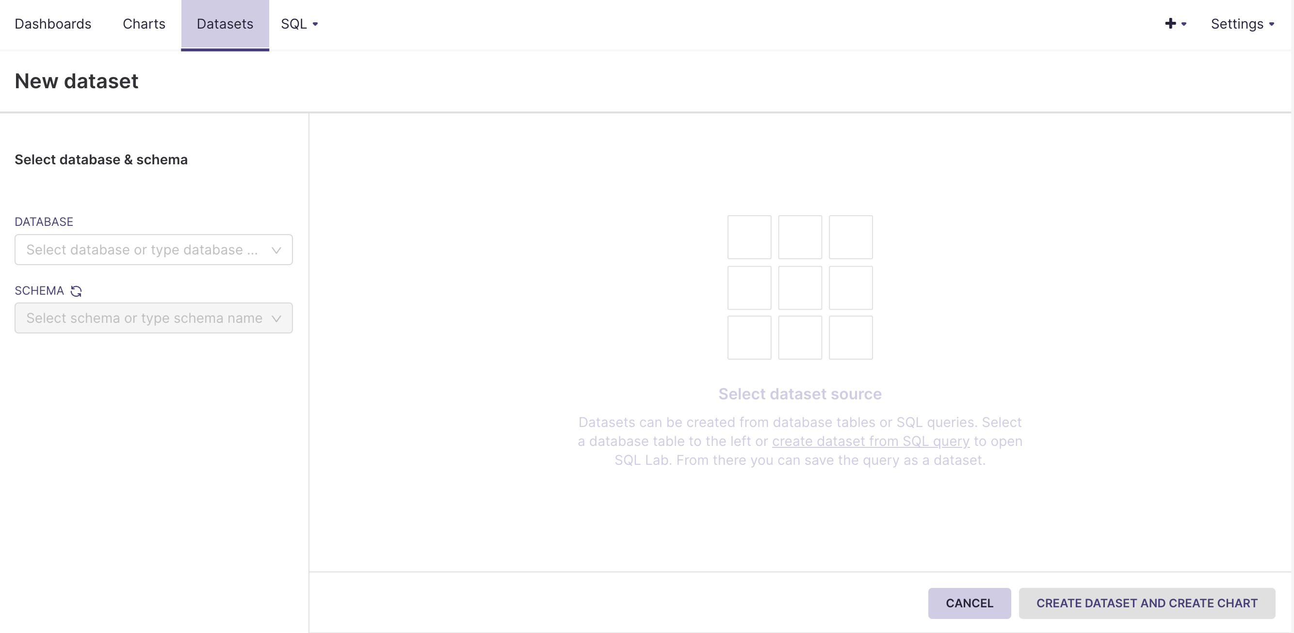
- Choose a database, schema, and table. Then click .
Adding Virtual Datasets
Virtual datasets are created by querying existing tables in Ganymede.
- Hover over SQL in the top menu bar and click on SQL Lab. This should bring you to a SQL editor, where you can preview tables and run SQL queries.
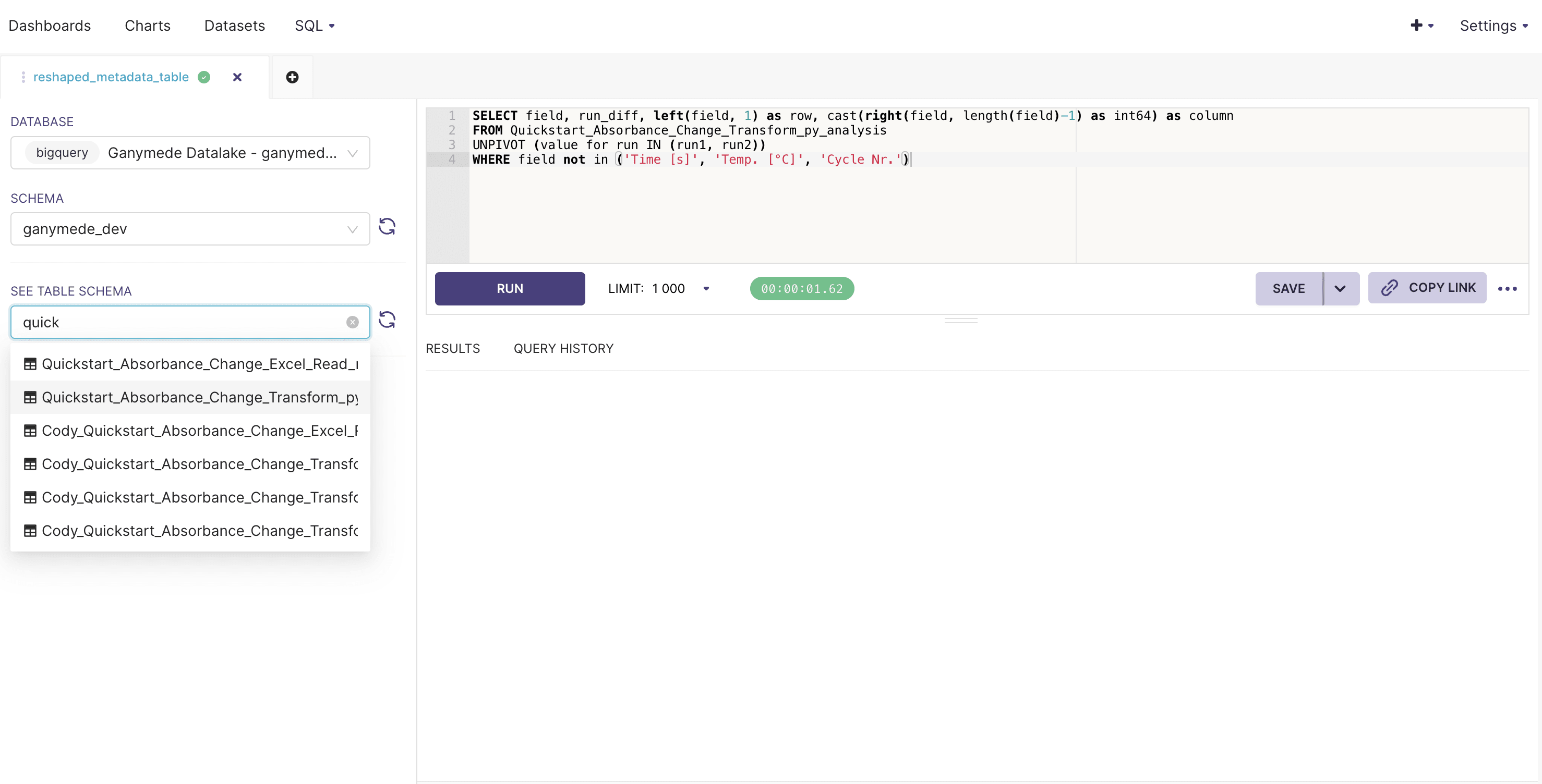
- Enter your SQL query, select the number of rows to preview, and click to execute the query.
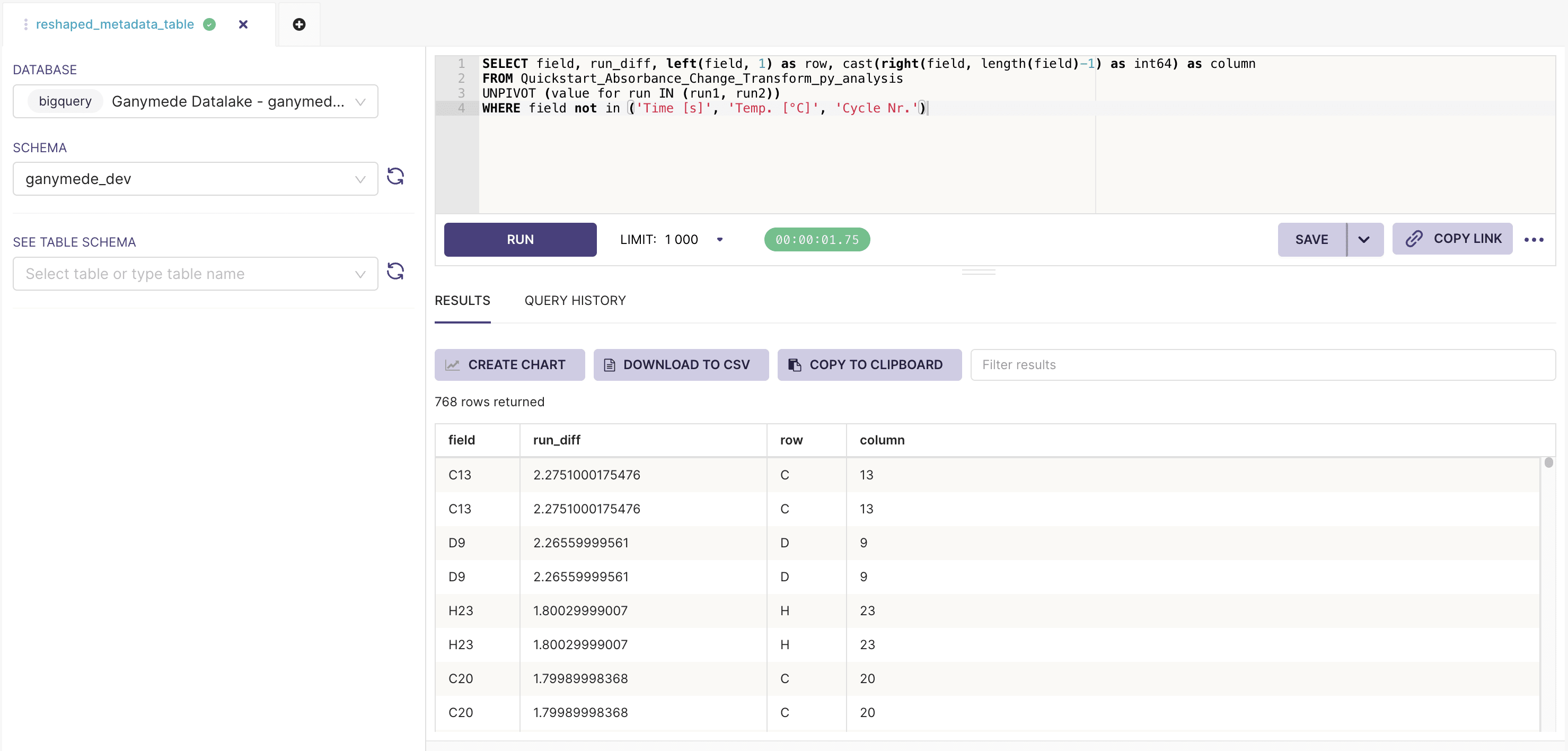
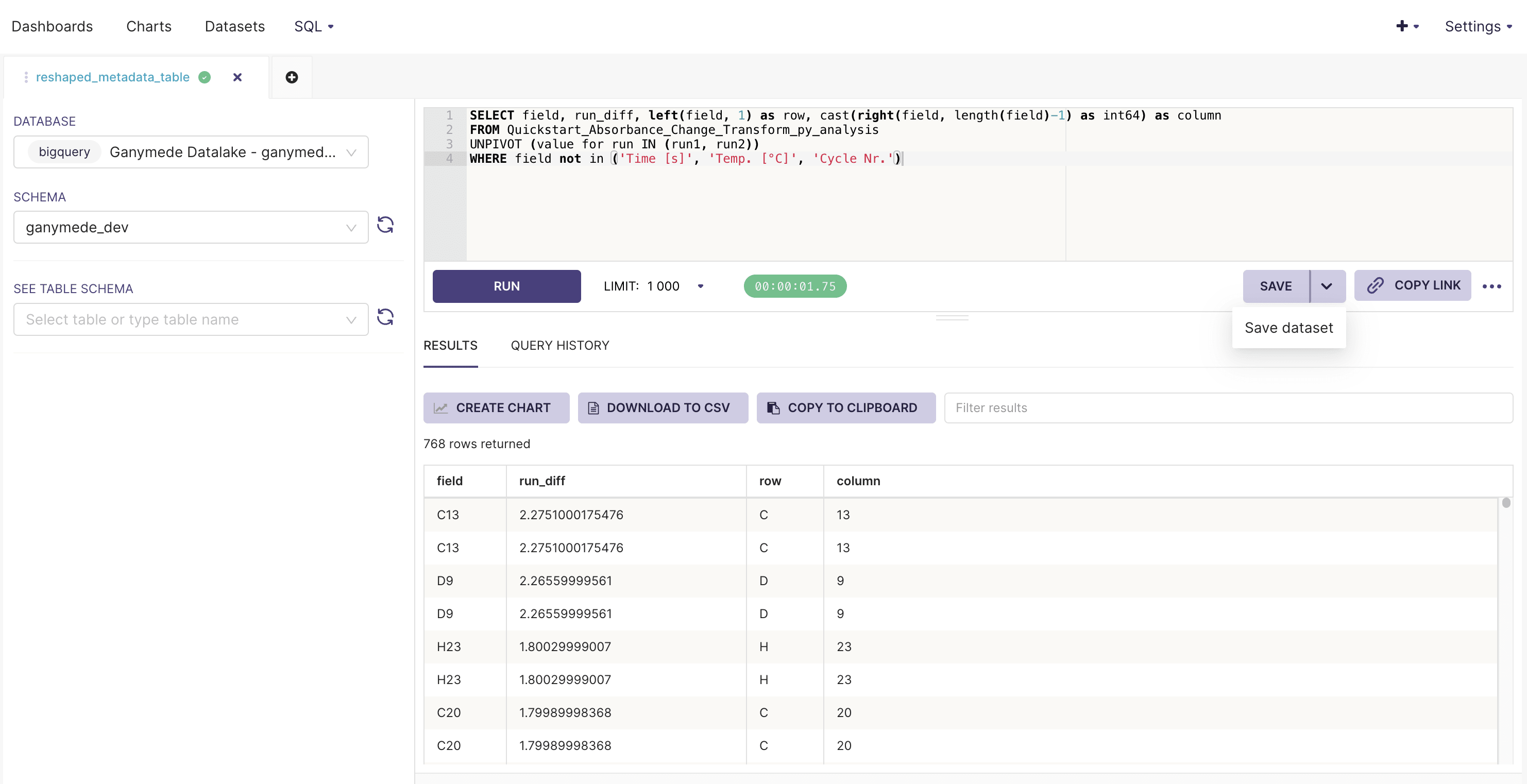
- To save the virtual dataset, click the next to the button, and select .
For a list of available functions and syntax guidance, please reference the SQL in BigQuery documentation.
The
button saves SQL queries for future edits, but does not register a query as a virtual dataset.Creating a chart
Charts can be created from physical or virtual datasets.
To create a chart:
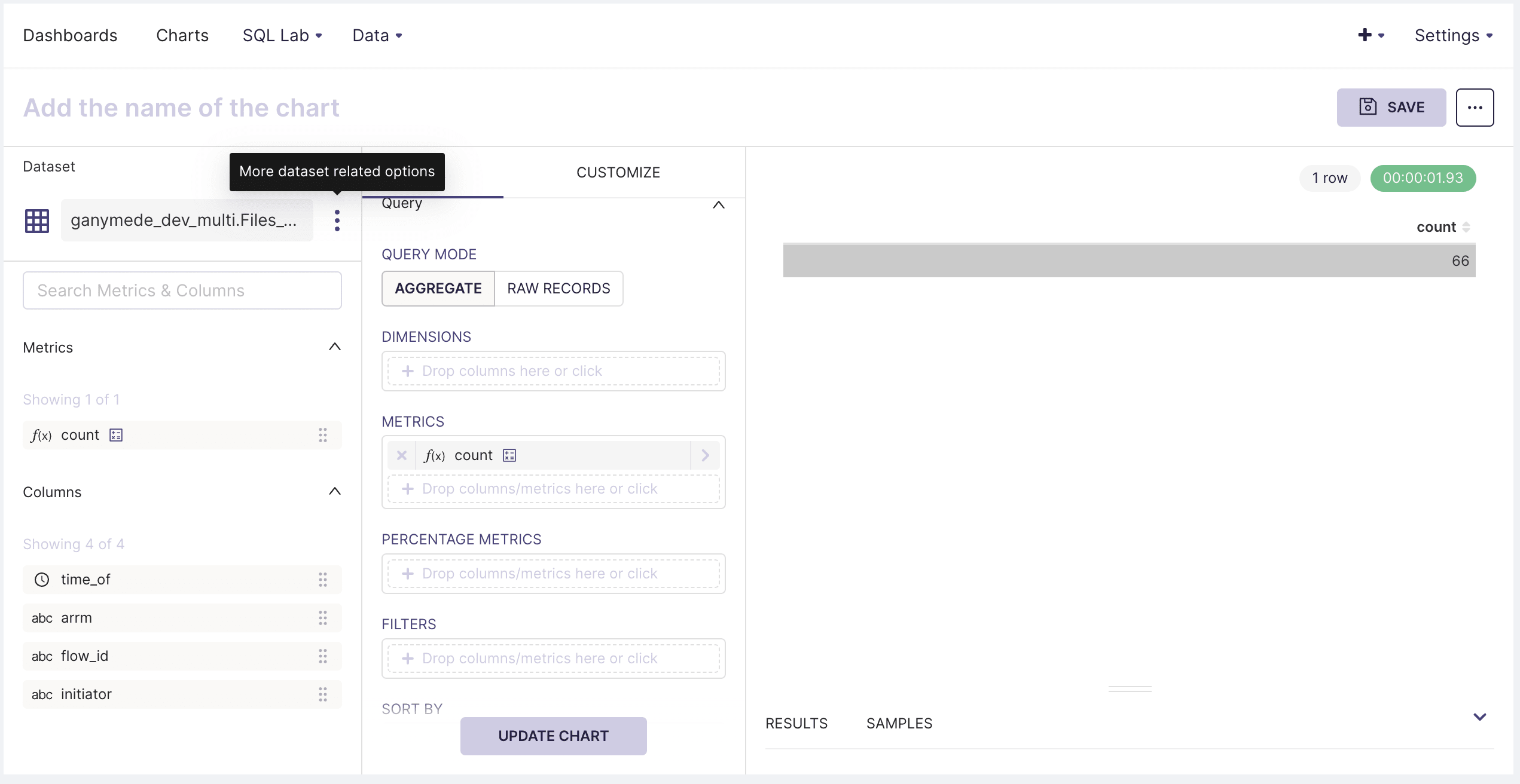
- Hover over Data in the top menu bar and click on Datasets. Select a dataset from the list, which will open the chart creation pane:
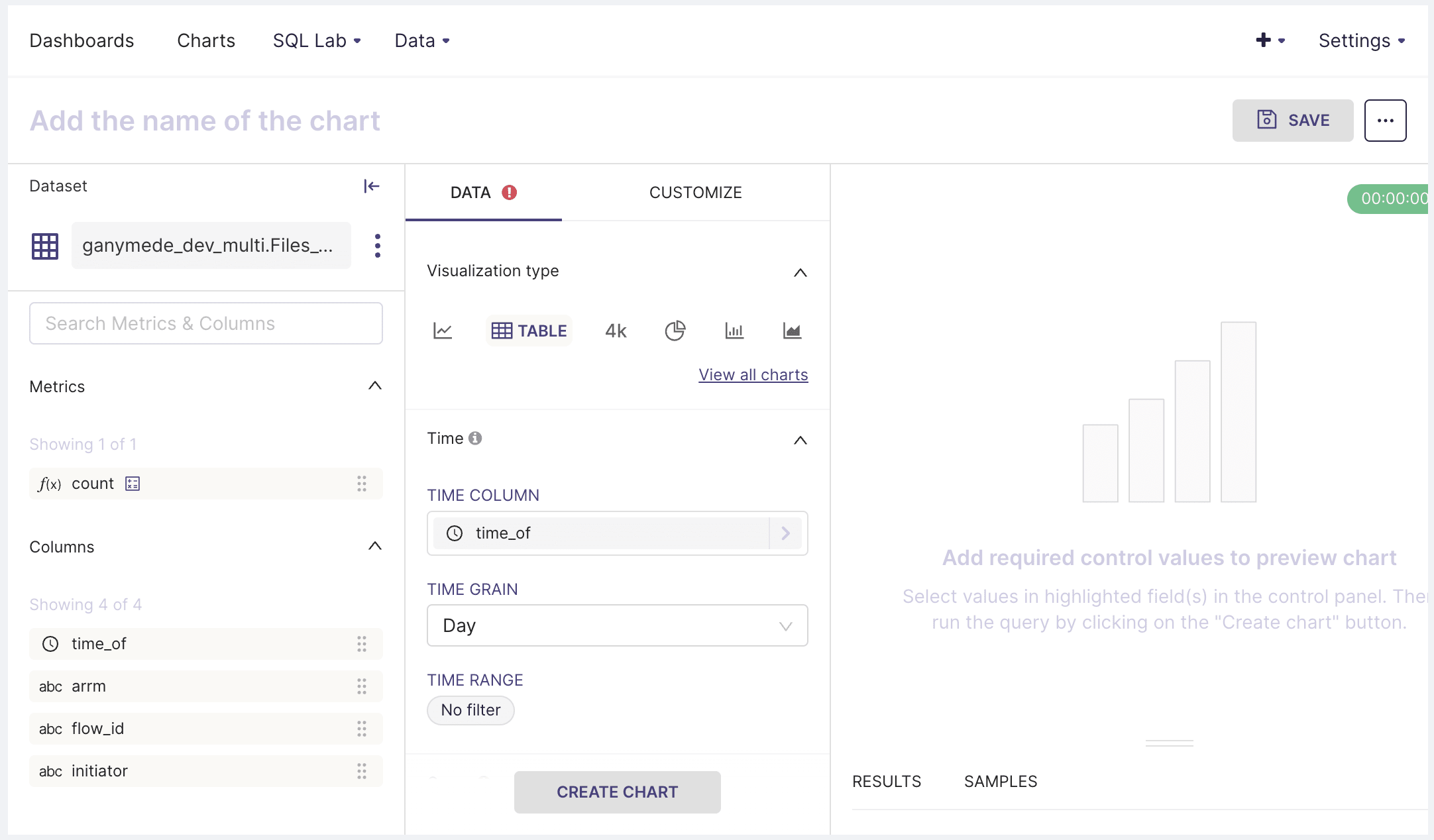
- Use the DATA tab to specify chart type and to pivot or aggregate data. The CUSTOMIZE tab allows you to annotate axis labels, specify axis formats, and set the chart title.
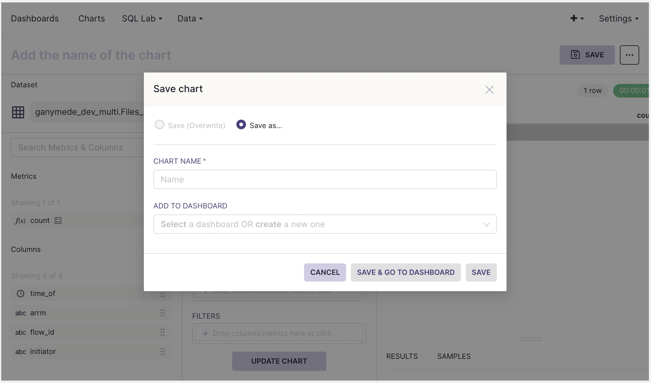
Saving charts to dashboards
Once the created chart is ready, click SAVE in the upper-right hand corner to add it to a dashboard:
Calculated columns
Calculated columns are useful for refining data visualization. Examples include:
- Taking the floor or ceiling of a variable to truncate data outside of a desired range
- Categorizing or subsetting data through string manipulation
- Extracting values for aggregation
To create a calculated column:
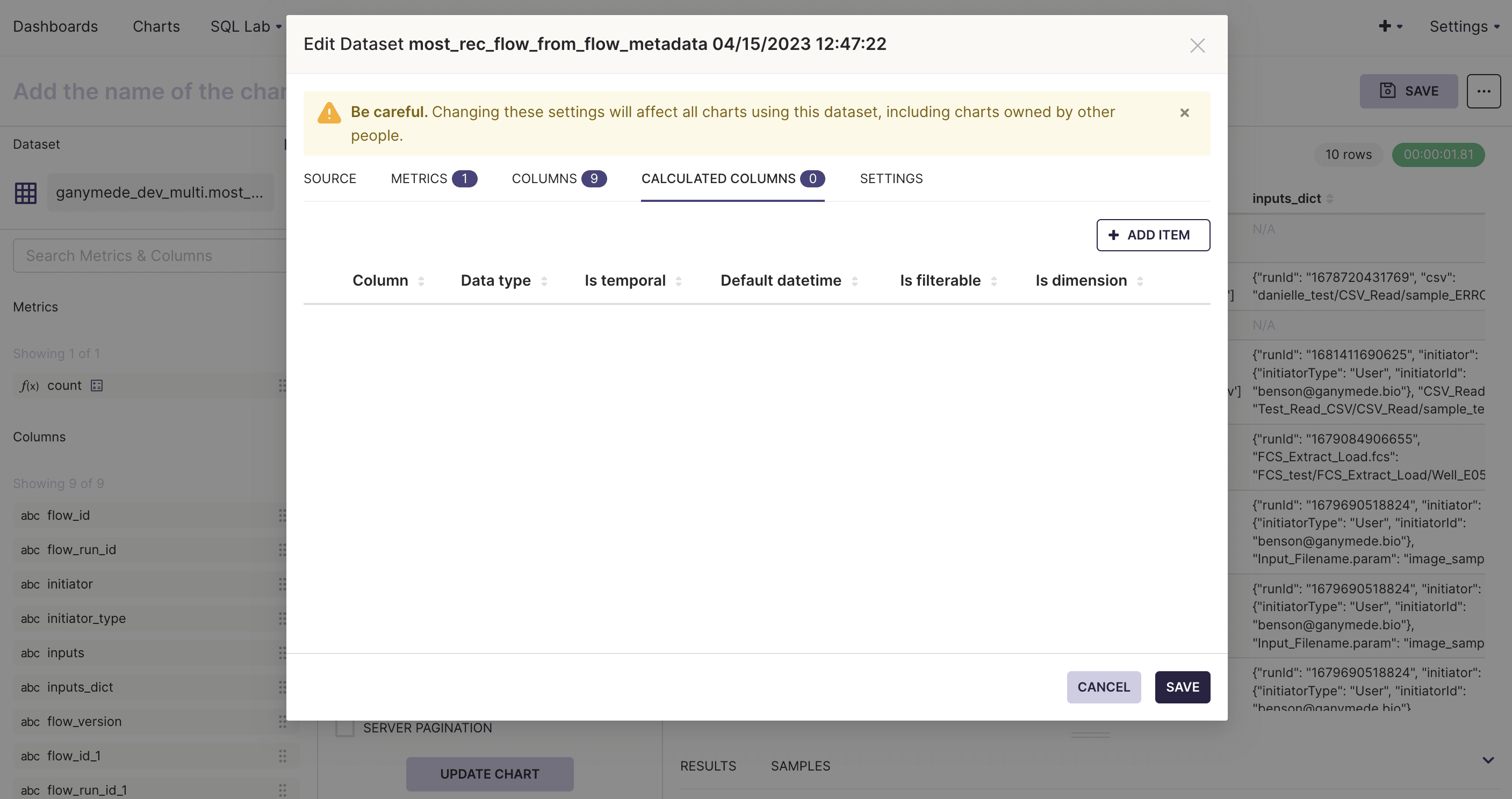
- Hover over the three dots to the right of the dataset on the Chart Creation page and click Edit Dataset.
- Select the Calculated Columns tab to add new columns to the dataset. Specify the field definition using a SQL expression.
Calculated columns are more flexible than what is found in other BI tools offering similar functionality. Beyond aggregation, these fields can be filtered on, sorted by, and/or used to categorize data.
Adding Jinja Templates to SQL Queries
There are two ways to use Jinja templates in SQL queries:
- Virtual Queries
- Metrics
Example Using Virtual Queries
An example virtual query that inherits inputs from a filter can be constructed to use Jinja templates using:
{% set variable_name = filter_values('some_column_name')[0] if filter_values('some_column_name') else 1 %}

SELECT
  *,
  {{ variable_name }} AS inherited_filter_value,
  value * {{ variable_name }} AS value_multiplied_by_inherited_filter_value
FROM table_name
In this example, a variable is set by calling the filter_values function, a function native to the dashboard environment.
The first value chosen is returned, since filter_values returns a list of selected values by default.
The if statement checks to see a filtered value was selected on column some_column_name and returns 1 otherwise.
This assigns a default value to the query so that the dataset can be created and not raise any errors if there are no active
filtered values present on that column. A dataset will not be savable without the if statement.
After saving the query to a virtual dataset, any chart in a dashboard will have the Jinja template automatically be rendered.
Examples Using Metrics
Creating a chart, a line chart for instance, requires creating a metric on that variable. You can use filter values by either referencing the new column created in a virtual query or by making the metric as follows:
AVG(value * {{ filter_values('some_column_name')[0] if filter_values('some_column_name') else 1}})
Where this mimics what was done in the virtual dataset above but instead works for both virtual and
physical datasets. The if statement is required here as well in order for the chart to be displayed
when a filter is not selected on some_column_name.
Having More Control Of Dashboard Filters with Jinja Templates: Regex or Other Variations
Filters at the dashboard level by default require a dataset and a column to be associated with them.
To apply the filters, you either need to manually select the individual filters or click
Select All. With Jinja templating, you can have more flexibility in your filters such as the use
of regex. Follow these steps to have Jinja templated regex filters or other variations
- Enter the
Edit chartof the chart you wish to add the filter for - In the
Filterssection, add the following
REGEXP_CONTAINS(
  my_column_to_filter,
  ARRAY_TO_STRING({{ filter_values('column_that_has_regex') }}, '|')
)
You do not need to have an if else expression in the Jinja template here.
- Save the chart
- At the dashboard level, click
+ ADD/EDIT FILTERS - Add a new filter on some dataset that contains the column 'column_that_has_regex'. Make sure the column name and dataset name do not exist in your dashboard to prevent your charts from inheriting it and doing a hard filter.
- This can contain pre-defined regex expressions or you can pre-filter the column in the
Pre-filter available valuesin the Filter Configuration section to remove all values in case this is a dummy dataset and you mostly just want the users to type in the regex manually. - Save the filters.
- You are now ready to have regex based filters in your dashboard!
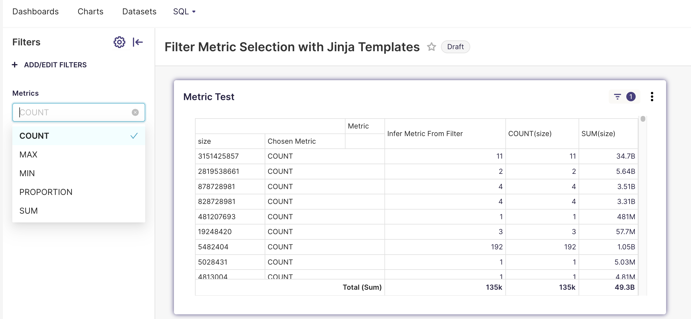
Filters to control aggregation metrics
The chart editor allows you to specify which aggregation function to use in the metric. Jinja templating can be used in the metric editor to specify which one to use through filters.
Dataset for Metric Filters
Create a virtual dataset in SQL lab with the following query and name it Metric
SELECT 'COUNT' AS Metric
UNION ALL
SELECT 'SUM' AS Metric
UNION ALL
SELECT 'MAX' AS Metric
UNION ALL
SELECT 'MIN' AS Metric
UNION ALL
SELECT 'PROPORTION' AS Metric
And add or remove aggregate methods as appropriate.
The Metric in the Chart Editor
Place the following, or a modified version, in the custom query of the metric editor.
{% set metric = filter_values('Metric')[0] %}
{% set variable = 'my_variable' %}
{% if metric == 'PROPORTION' %}
    COUNT({{ variable }}) / SUM(COUNT(*)) OVER ()
{% else %}
    {{ metric }}({{ variable }})
{% endif %}
where my_variable is a column in the dataset to apply the aggregation to. The IF-ELSE is handled by Jinja rendering to prevent issues where SQL tries to evaluate metrics that aren't appropriate aggregate functions i.e. PROPORTION(size) which would fail. This method will properly construct the query before it is validated by SQL. For simpler metrics, you can directly do something like
{{ filter_values('Metric')[0] + '(my_variable)' }}
in the metric.
The variable can also be inherited from a filter as well, something like
{% set variable = filter_values('Variable')[0] %}
would work.
Example
Notes
Its important to make sure that you have
- if statements to check if a filter value is present
- You are referencing the column name that is being filtered on in the dashboard
a. For instance you have a filter defined in the dashboard named
My Filtercreated on datasetmy_dataseton columnsome_column_namewheresome_column_nameis referenced in the Jinja template - The column name is not contained in the dataset you are using the Jinja template in (unless you actually want your chart to be filtered as well)
- You may need to wrap your Jinja template in a CAST to convert to INT or NUMERIC if necessary
- filter_values returns a list and needs to be handled appropriately i.e. filter_values('Column')[0] or ARRAY_TO_STRING(filter_values('Column'))
- Other useful links for more detail or other use cases of Jinja:
a. From Preset website
b. From Apache Superset website
Editing dashboards
To edit a dashboard:
- Select Dashboards from the top menu bar and navigate to the desired dashboard. Click to resize and rearrange the layout of different charts.
- To filter data within graphs, click the icon on the left side of the dashboard, then select and use the SCOPING panel to apply filters.
Dashboards can only be edited by their owner(s). One method for multiple users to avoid conflicting dataset modifications would be for users of shared datasets to create virtual datasets for their own use.
The SCOPING tab on the filters modal allows users to specify which graphs the filter applies to. Note that if 2 charts are backed by different datasets which share a field name, a single filter can be used to manipulate both tables simultaneously.