Dashboard Tips and Tricks
Tips
Including headers, text, dividers, and tabs to dashboard
- In the dashboard page, click
EDIT DASHBOARD - On the right side of the page, click the LAYOUT ELEMENTS tab
- Drag and drop tabs, text boxes, headers, etc
These can be used to add descriptions to your dashboard. The text boxes and headers are markdown editors which can include hyperlinks that can point to flow pages or other dashboards. The tabs allow you to separate out charts into different tabs to group relevant charts together. Filters can be configured to work with different tabs. Filters that are not relevant to the specific tab you are on will be hidden under a dropdown and classified as out of scope. Tabs act as their own mini dashboards with unique links that will point to that tab in the dashboard.
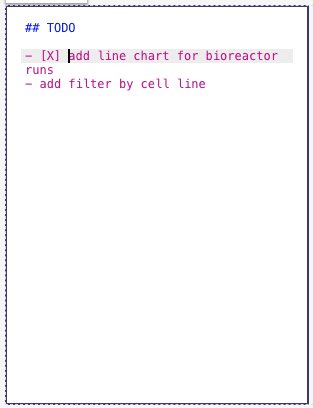
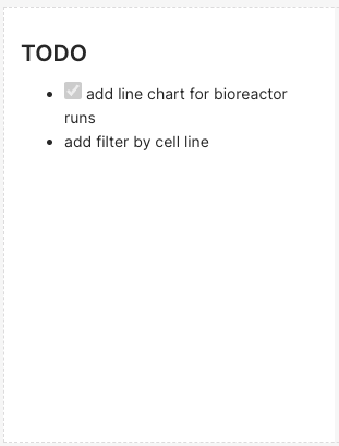
The images below display a common use case for dashboards during development - as a means for tracking outstanding tasks to perform.
Creating more meaningful labels for table chart types
Variables are saved with to the database with spaces and special characters replaced with
underscores. However, you can change the label shown in tables with something more meaningful such
as adding spaces, units, etc in the Edit dataset from Chart Source. In the Columns tab, click
the dropdown for the variable you want to add a label to and fill in the LABEL field. For an
example, if your variable is my_variable you can set the label to be My Variable (units) and
this would automatically set the column name in your table chart types to this new label.
Customizing chart colors
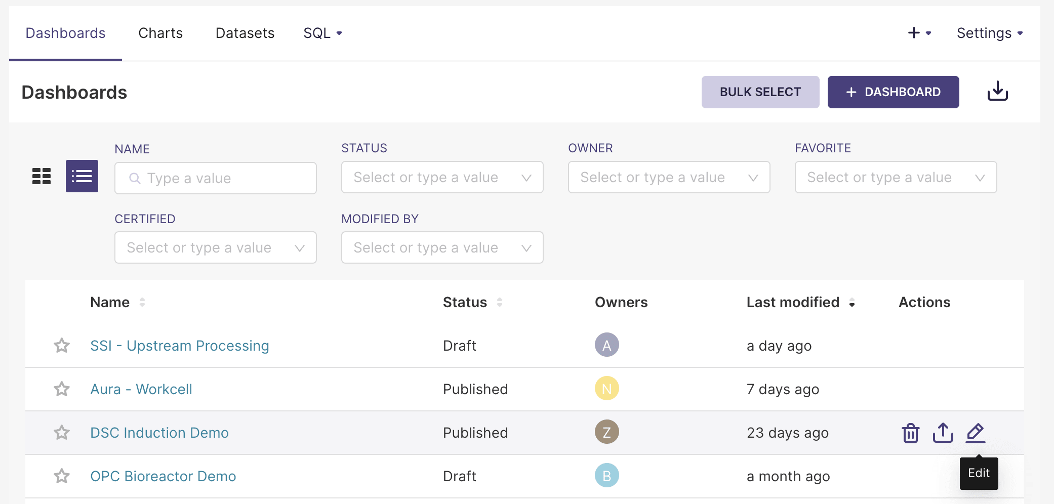
Chart colors can be customized at the dashboard level, or at the label level for dashboards. To customize dashboard colors, select
the Dashboards panel in the top bar, navigate to your dashboard row, hover over the Actions column, and
click on the
Doing so opens up a Dashboard properties window, which contains a Color Scheme dropdown for specifying dashboard colors:
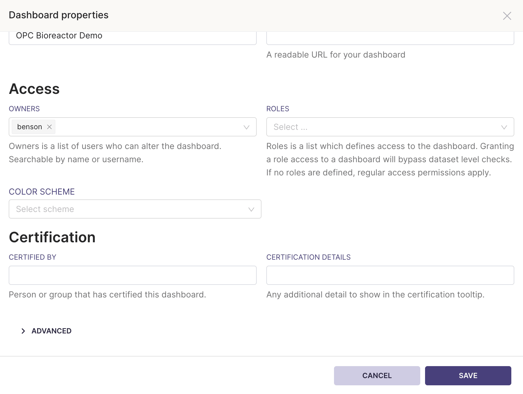
Customizing label colors
Within the Dashboard properties window, expand the Advanced section. This opens up a JSON editor, where you can specify label colors by hex code. An example specification is shown below:
{
  "label_colors": {
    "error": "#B22222",
    "running": "#01FF70",
    "success": "#2ECC40",
    "warning": "#FFFF00",
    "caution": "#FFA500"
  }
}
It's important to ensure that the colors can be readily distinguished. As a starting point, you can use a color palette generator to generate a set of colors that are visually distinct.
Troubleshooting
Dashboard chart shows an error message that the dataset is missing but it does exist and linked to the chart
If the chart was properly displayed in the the Edit Chart page but it throws this error in the
dashboard then this could happen when you have two charts named the same where one has a missing dataset. The
dashboard could pull in the chart that has the missing dataset. You can fix this by renaming the
chart to be unique or delete the chart with the missing dataset.
How do you create bar plots with proportions and percentages?
In the chart editor page
- Click the
+ Drop columns/metrics here or clickin the metrics section of the query. - Move to the CUSTOM SQL tab
- Enter the following formula in the editor space
COUNTIF(my_column = 'my_value') / COUNT(*)
More general proportions can be found with
COUNT(*) / SUM(COUNT(*)) OVER (PARTITION BY x_axis_variable)
I added a new column but I do not see it in the columns side bar in the editor chart page.
In the chart editor page
- Click the ⋮ in the
Chart Sourceside bar - Click editor
Edit dataset - Click the COLUMNS tab
- Click
SYNC COLUMNS FROM SOURCE - Save
I do not see the full range of values on the x-axis of my line plot
This could be due to there being to many digits in the data being displayed, which can be fixed by rounding the data.
- Click the column of interest in
X-AXISQuery section - Click the CUSTOM SQL tab
- Modify the sql command to be
ROUND(my_column, 2)
- Update chart
I am creating a line chart but the line is patchy and not full connected
If the spacing between adjacent data points is too large, superset will have trouble connecting the points together. You can fill in the data in the chart editor page
- Expand the
Advanced analyticssection in the DATA tab - Select an option in the
RULEsuch as 1 hourly frequency - Select the
FILL METHODsuch as Linear interpolation - Update chart
Another approach might be to increase the ROW LIMIT in the DATA tab if you have a large
dataset.
I am creating a line chart but there are regions of the plot with missing data
Sometimes the superset will have trouble displaying any data in certain regions of the line chart. You
can confirm that the plot recognizes that point by hovering the mouse in those regions to see if
a hover box displays with the values. If the data is not time-series, you can try turning on marker
in the Chart Options of the Customize tab. This will at least allow you to see the data points
in the plot.
I am creating a line chart with time series but getting a 404 Post Error... Braced constructors are not supported
This could mean that superset is having trouble recognizing your time series variable as a time stamp
or datetime variable. You can try creating a calculated variable in the Edit dataset from Chart Source; for example, if your time variable is in epoch time, then you can convert it to a datetime variable with
-- use TIMESTAMP_SECONDS or TIMESTAMP_MICROS if your time is in seconds or microseconds
DATETIME(TIMESTAMP_MILLIS(my_time_variable))
And then ensure that the variable type to DATETIME in the DATA TYPE section.